
Are you interested in presenting customer behavior? Or generally any creative thinking or cognitive-related topic to your team? For your inspiration, we’ve prepared a design makeover example with a head and brain graphic presentation slide.
We try to share here effective presentation graphics that doesn’t acquire too much time and are rather simple to recreate on your own.
Head and Brain Graphic Presentation Slide Before the Redesign
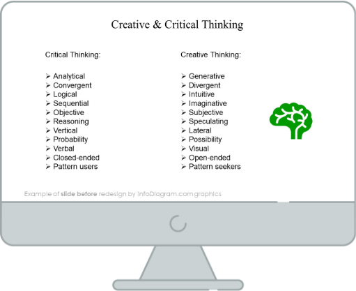
Our source slide presented here looks very simple and plain. There aren’t any specific distinguishments, and it uses old-looking bullet points that make it harder to read the slide at once.
Head and Brain Graphic Presentation Slide After the Redesign

Look at that change in this redesigned slide. Sometimes with a few simple design tweaks and easy-to-implement elements you can get a much more interesting presentation slide!
Let’s have a closer look at both.
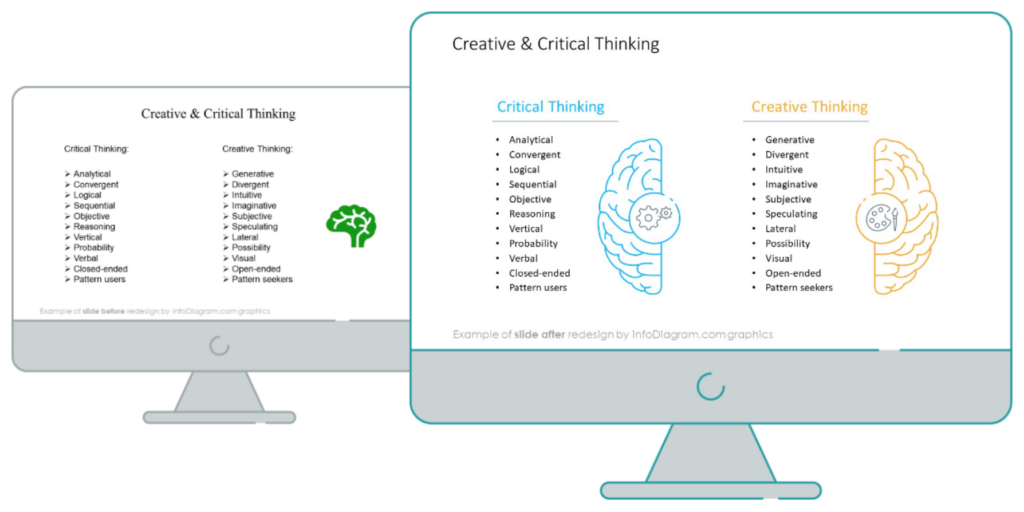
The uplifted redesigned slide looks much more appealing and readable, even if the presented information is the same. See how we made this retouch with four simple steps.
Step 1. Align Your Text to Readable Mode
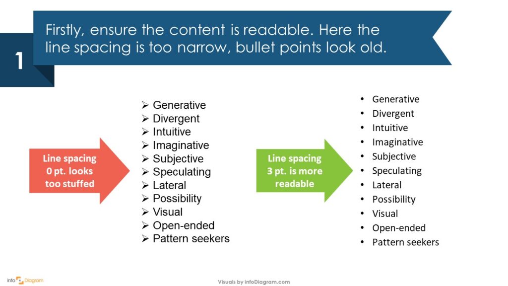
When you’re placing text in your presentation, it can be quite tricky when it comes to balancing between sufficient, readable information and overly-stuffed text. Luckily, it’s not unachievable. If you’re using enumeration for your discussion topic, make sure to have a space between each section. Here we have replaced the arrows with standard bullet points and used Calibri font to make everything look clearer and easier to understand.
Step 2. Have Enough Space for Text and Graphic Elements
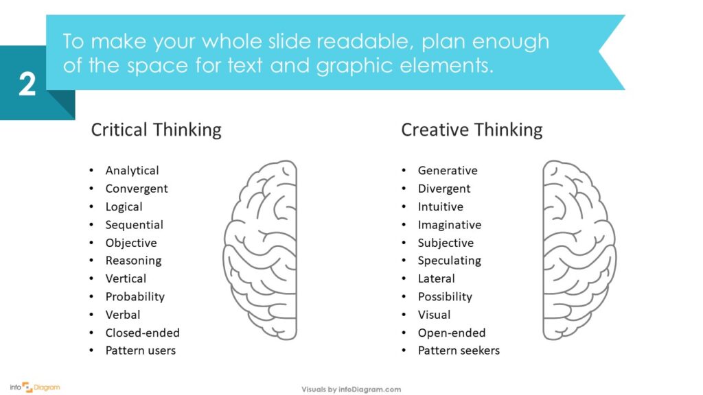
After we improved the text structure, we placed brain vector images in the rest of the space – the right hemisphere along with the creative thinking explanation, and the left with critical thinking.
Step 3. Use Color for Element Distinguishment
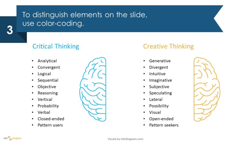
It’s quite important to use color-coding in order to distinguish the elements presented. Notice how we used orange for both the creative thinking title and the right-side brain, and blue for the critical thinking section and the left-side brain. This will help your audience to understand also subconsciously there are two distinct categories. And the slide will look more attractive, too.
Step 4. As a Final Touch, Add Icons and Lines
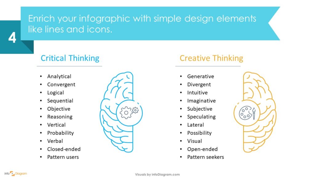
Add graphic design elements such as line vectors and icons to make your presentation even more unique and impactful. In our case, we’ve added lines under both titles, to further emphasize them. In the creative thinking section, we have added a palette icon as an association with art and creativity, whereas in the critical thinking section, the gear icon represents process, work, and innovation.
For more ideas on how to represent abstract concepts such as creativity or processes using single icons, have look at this article: 50+ visual metaphors to present a business concept in a presentation.
I hope this simple guide has inspired you to make interesting graphics yourself for any upcoming presentation. If you’re not familiar with designing PowerPoint slides, you can learn with this free sample set.
If YouTube Video Tutorials are your go-to, we’ve also prepared one for you:
If you are specializing in human behavior and want to discuss this topic more extendedly, you can check this Ying Yang PPT Template.
Source
The graphic slide makeover used in this post is part of the infoDiagram Creative Brain and Head Outline Infographics Template collection. Check there for more redesigned slide ideas.
You may also have a look at this blog for Presenting Creative Thinking with Head and Brain Graphics.
Recent Posts

The Importance of a Spell Checking in PowerPoint Presentations
As a designer, I can write long posts about the importance of good design on slides 🙂 However, one aspect that is often overlooked but equally important is the accuracy of text on a slide. Typos and spelling errors can undermine your credibility, distract your audience, and diminish the overall effectiveness of your presentation. Let […]

Introduction to Align & Distribute PowerPoint Tools
In the realm of PowerPoint presentations, the visual aspect plays a crucial role in conveying information effectively. Proper alignment can bring order, consistency, and polish to your presentation. In this post, I’ll explore the importance of alignment in PowerPoint and introduce you to the Align & Distribute tools that can take your slide design to […]

The Most Common Mistakes in a Presentation to Avoid
Have you ever wondered what the most common mistakes are when preparing a PowerPoint presentation? Do you think you might be making these mistakes? Let’s find out. I have prepared a list of the most common mistakes made on slides for you:

Slide Redesign: Presenting Business Values with a Radar Chart
Let’s talk a little about charts in PowerPoint 🙂 Have you ever used a specific chart type called radar? I bet your answer is NO or RARELY and I’m not surprised. The most common charts used in PowerPoint presentations are bar charts and pie charts but I’d like to show you how to replace typical […]

Slide Redesign: Presenting the OKR Setting Process with a Timeline Flowchart
Today I’d like to show you how creatively you can replace a typical and not attractive table with a timeline flowchart. I chose the example of the OKR setting process which contains 3 steps and has quite a lot of text, so it’s a more difficult task because there is not much area to use […]

Slide Redesign: Presenting the Meeting Agenda with a Creative Timeline
I’d like to show you how you can creatively present your meeting agenda in PowerPoint. Creating a list of consecutive meeting sections is not enough to grasp your audience’s attention. If you present the agenda the boring way, it’s gonna be a signal to your participants that the meeting might be boring too. Content is […]

Slide Redesign: Presenting the List of NPS Benefits with a Creative Infographic
I’d like to show you an alternative way of presenting a list of the benefits in PowerPoint. Actually, a list doesn’t mean that text must be arranged in bullet points or numbers. This way of presenting content is so ordinary and common that slides with typical lists do not impress the audience. I will explain […]

What Fonts To Use In PowerPoint Presentation
What fonts are good to use, to make your slide look professional? Let us suggest you several font proposals and where to get them from.

7 Design Tips for Professional PowerPoint Slide
Here are some design best-practice rules to help you create a professional visual slides in PowerPoint:

Slide Redesign: Presenting the Process of Employer Branding with the Roadmap
Today I’d like to show you a redesign of a PowerPoint slide with a multistep process with subcategories. Probably the first version will be in a form of numbered text list presenting each step. Yes, you can create it that way, but we’d like to make our slide look more attractive visually. I will work […]

Slide Redesign: Project Launch Stages Illustrated with Activities Icons
Do you present the launch stages of your project? The easiest way to present stages is to use a number or bullet list. But it’s a common and boring solution. Let’s try to avoid using a typical PowerPoint list and instead of it let’s make a creative slide. In today’s case study, we’re going to […]

Slide Redesign: Presenting Team or Contact Persons
Do you need to present in your pitch deck the key persons to contact? The easiest way to show your team on the slide is to put the data into the table. But we don’t want to use a typical table that we know from Excel. Let’s create an interesting infographic in PowerPoint on the […]

Slide Design: BCG Comparison Matrix in PowerPoint
Do you need to compare several options over two criteria? Try to use a matrix visual form. To create such a matrix comparison in your presentation you don’t need any special software for that. You can do it very easily in PowerPoint. And such a matrice can look very attractive. I’m going to illustrate it […]

Slide Redesign: Checklist in PowerPoint on Due Diligence Example
Do you need to present a checklist of some kind? In today’s blog, we will give you some directions on how to redesign a checklist type of slide content, on the example of legal due diligence. But first, let’s see why we have optioned a checklist, rather than a standard bullet point text.

Slide Redesign: Use Road Signs Graphics for Rule Incorporation
Do you need to express rules, regulations or dos and don’ts on a slide? Consider illustrating your points with a visual metaphor everybody recognizes – traffic signs. Adding such graphics will help you to pass a clear message while having the audience’s full attention thanks to the symbols. Let’s see how we can redesign a […]