
I’m going to present you a few tips to use in PowerPoint for a graphical change of leaflet with a company snapshot.
We will use the one-sheet leaflet containing business key information in a snapshot, also called a one-pager.
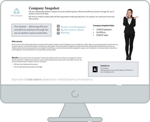
Slide with company snapshot before the redesign
Our source slide contains a lot of text blocks and is hard to read.
Let’s see how you can change it into a visually appealing infographic, using just a few hints.
Slide after the redesign
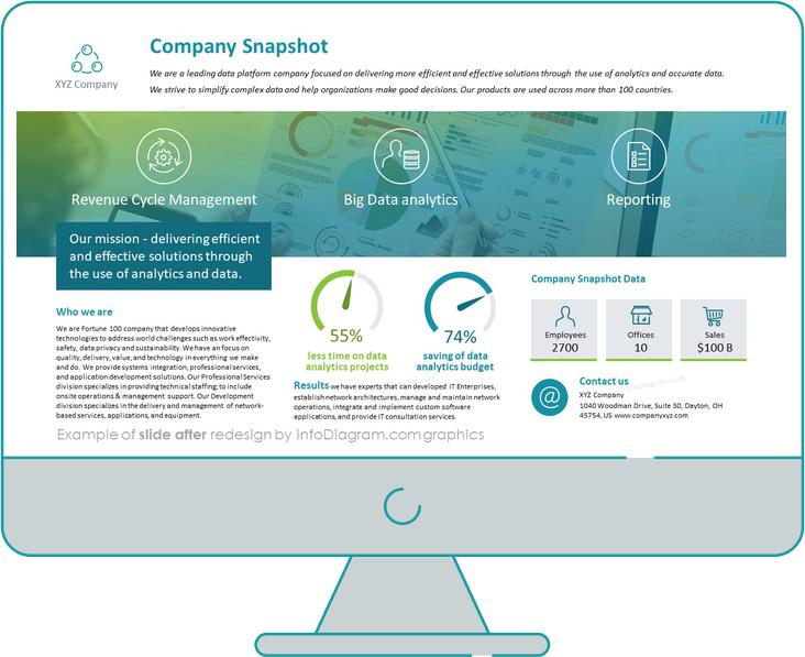
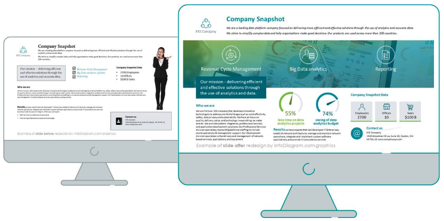
Let’s analyze the process of this slide transformation. When we put together both slides, you can spot that facelifted slide looks uncluttered and easy to understand.
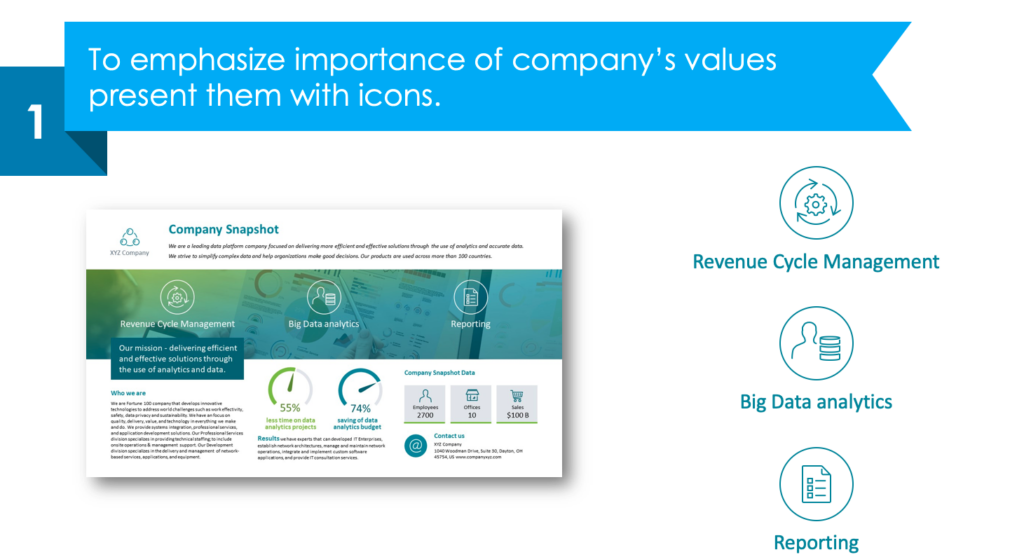
Hint 1: Highlight the most important values with icons
Symbols are attractive to read by human eyes. With properly chosen icons (in the example below are used minimalist outline styled icons), you can catch the audience’s attention.
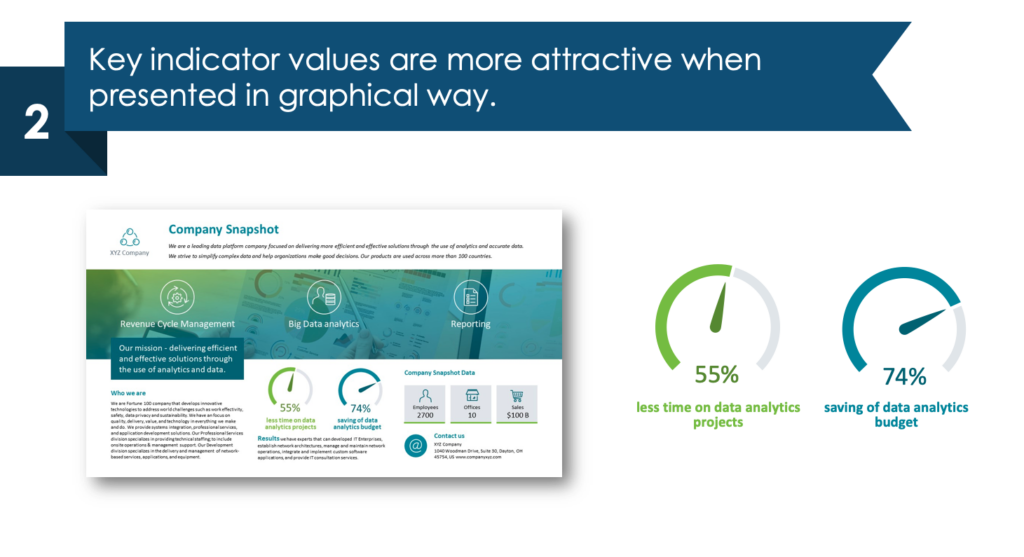
Hint 2: Visualise key indicators with graphic gauges
Data containing percentage indicators are easier to remember when visualised with a graphic explanation. Gauge is a great example of it. It’s a very easy trick – the adequate part of the gauge is marked with a color symbolizing the percentage amount.
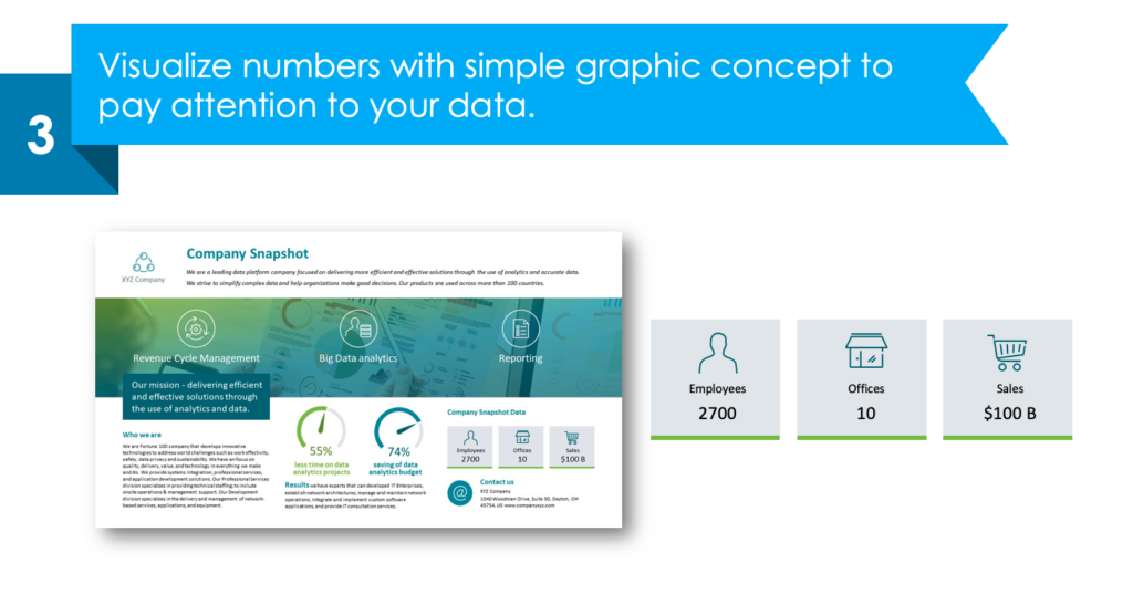
Hint 3: Use the simple graphic concepts for the company data
Such data as the number of employees, amount of branches, offices, or sales incomes look visually compelling, when presented as a graphic concept. Such a concept can be a joining of the icons, titles, and numbers.
Check the slide below how such a little graphic concept was created with a square shape as a background.
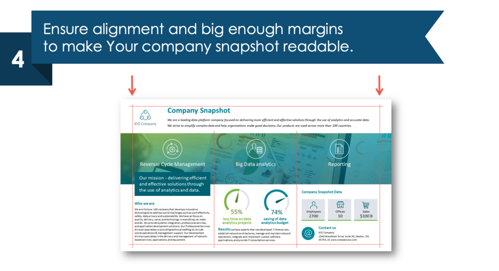
Hint 4: Alignment and margins should be equal
Take care to keep margins and alignment equal on the left and right sides and analogically at the top and the bottom of the slide. Otherwise, your content will look overloaded.
I hope you will find this new slide design easy to grasp and inspirational. For more redesign ideas check our series of posts How to redesign slide.
Here is a YouTube movie illustrating more parts of Company Snapshot One-pager Leaflet.
Sources
The slide makeover graphics we described here is based on the Company Snapshot One Pager Leaflet (PowerPoint Template) infodiagram collection. Check there more slide graphics of this topic.
In addition, check this blog post Company Snapshot One Pager Leaflet made in PowerPoint out.
Related Posts
You may also like other posts.

The Importance of a Spell Checking in PowerPoint Presentations
As a designer, I can write long posts about the importance of good design on slides 🙂 However, one aspect that is often overlooked but equally important is the accuracy of text on a slide. Typos and spelling errors can undermine your credibility, distract your audience, and diminish the overall effectiveness of your presentation. Let […]

Introduction to Align & Distribute PowerPoint Tools
In the realm of PowerPoint presentations, the visual aspect plays a crucial role in conveying information effectively. Proper alignment can bring order, consistency, and polish to your presentation. In this post, I’ll explore the importance of alignment in PowerPoint and introduce you to the Align & Distribute tools that can take your slide design to […]

The Most Common Mistakes in a Presentation to Avoid
Have you ever wondered what the most common mistakes are when preparing a PowerPoint presentation? Do you think you might be making these mistakes? Let’s find out. I have prepared a list of the most common mistakes made on slides for you:

Slide Redesign: Presenting Business Values with a Radar Chart
Let’s talk a little about charts in PowerPoint 🙂 Have you ever used a specific chart type called radar? I bet your answer is NO or RARELY and I’m not surprised. The most common charts used in PowerPoint presentations are bar charts and pie charts but I’d like to show you how to replace typical […]

Slide Redesign: Presenting the OKR Setting Process with a Timeline Flowchart
Today I’d like to show you how creatively you can replace a typical and not attractive table with a timeline flowchart. I chose the example of the OKR setting process which contains 3 steps and has quite a lot of text, so it’s a more difficult task because there is not much area to use […]

Slide Redesign: Presenting the Meeting Agenda with a Creative Timeline
I’d like to show you how you can creatively present your meeting agenda in PowerPoint. Creating a list of consecutive meeting sections is not enough to grasp your audience’s attention. If you present the agenda the boring way, it’s gonna be a signal to your participants that the meeting might be boring too. Content is […]

Slide Redesign: Presenting the List of NPS Benefits with a Creative Infographic
I’d like to show you an alternative way of presenting a list of the benefits in PowerPoint. Actually, a list doesn’t mean that text must be arranged in bullet points or numbers. This way of presenting content is so ordinary and common that slides with typical lists do not impress the audience. I will explain […]

What Fonts To Use In PowerPoint Presentation
What fonts are good to use, to make your slide look professional? Let us suggest you several font proposals and where to get them from.

7 Design Tips for Professional PowerPoint Slide
Here are some design best-practice rules to help you create a professional visual slides in PowerPoint:

Slide Redesign: Presenting the Process of Employer Branding with the Roadmap
Today I’d like to show you a redesign of a PowerPoint slide with a multistep process with subcategories. Probably the first version will be in a form of numbered text list presenting each step. Yes, you can create it that way, but we’d like to make our slide look more attractive visually. I will work […]

Slide Redesign: Project Launch Stages Illustrated with Activities Icons
Do you present the launch stages of your project? The easiest way to present stages is to use a number or bullet list. But it’s a common and boring solution. Let’s try to avoid using a typical PowerPoint list and instead of it let’s make a creative slide. In today’s case study, we’re going to […]

Slide Redesign: Presenting Team or Contact Persons
Do you need to present in your pitch deck the key persons to contact? The easiest way to show your team on the slide is to put the data into the table. But we don’t want to use a typical table that we know from Excel. Let’s create an interesting infographic in PowerPoint on the […]

Slide Design: BCG Comparison Matrix in PowerPoint
Do you need to compare several options over two criteria? Try to use a matrix visual form. To create such a matrix comparison in your presentation you don’t need any special software for that. You can do it very easily in PowerPoint. And such a matrice can look very attractive. I’m going to illustrate it […]

Slide Redesign: Checklist in PowerPoint on Due Diligence Example
Do you need to present a checklist of some kind? In today’s blog, we will give you some directions on how to redesign a checklist type of slide content, on the example of legal due diligence. But first, let’s see why we have optioned a checklist, rather than a standard bullet point text.

Slide Redesign: Use Road Signs Graphics for Rule Incorporation
Do you need to express rules, regulations or dos and don’ts on a slide? Consider illustrating your points with a visual metaphor everybody recognizes – traffic signs. Adding such graphics will help you to pass a clear message while having the audience’s full attention thanks to the symbols. Let’s see how we can redesign a […]