
Are you an established company dating back 10, 20, or even more years on the market? Do you need to outline your company timeline and achievements in a presentation, but you aren’t sure how?
Timelines are very often used in PowerPoint presentations. Well-prepared timeline is eye-catchy and easy to understand for the audience. With this post, I will show you how to tidy up your slides full of dates and text by using a flowchart diagram with only a few simple steps.
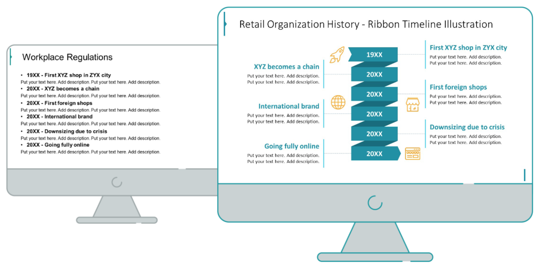
Company Timeline Slide Before the Redesign
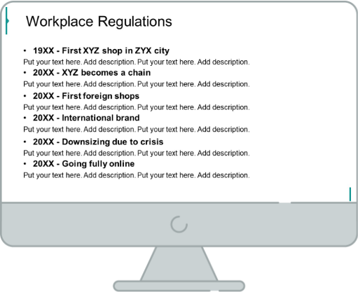
The source slide presented here uses an overwhelming bullet list, which doesn’t look attractive. Lack of space between the lines of each bullet is a common mistake in slide design. In our example, it makes the content barely readable.
Let’s see how we can beautify it by adding some infographic elements.
Company Timeline Slide After the Redesign
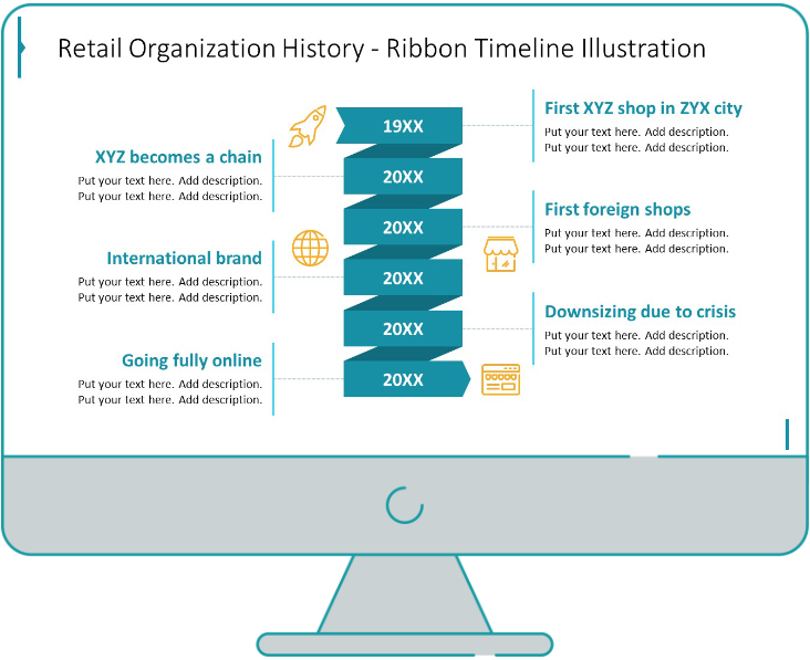
When compared together, we can see that the uplifted slide looks more appealing, engaging, and draws attention, thanks to the elements we included, like ribbons, and icons.
Let’s get onto the redesigning steps to learn more.
Tip from designers: Bullet points are very easy to be replaced with a timeline. Each point on the bullet list will be a separate point on our timeline. But it’s very important to plan the position of points and margins in advance to leave enough space around.
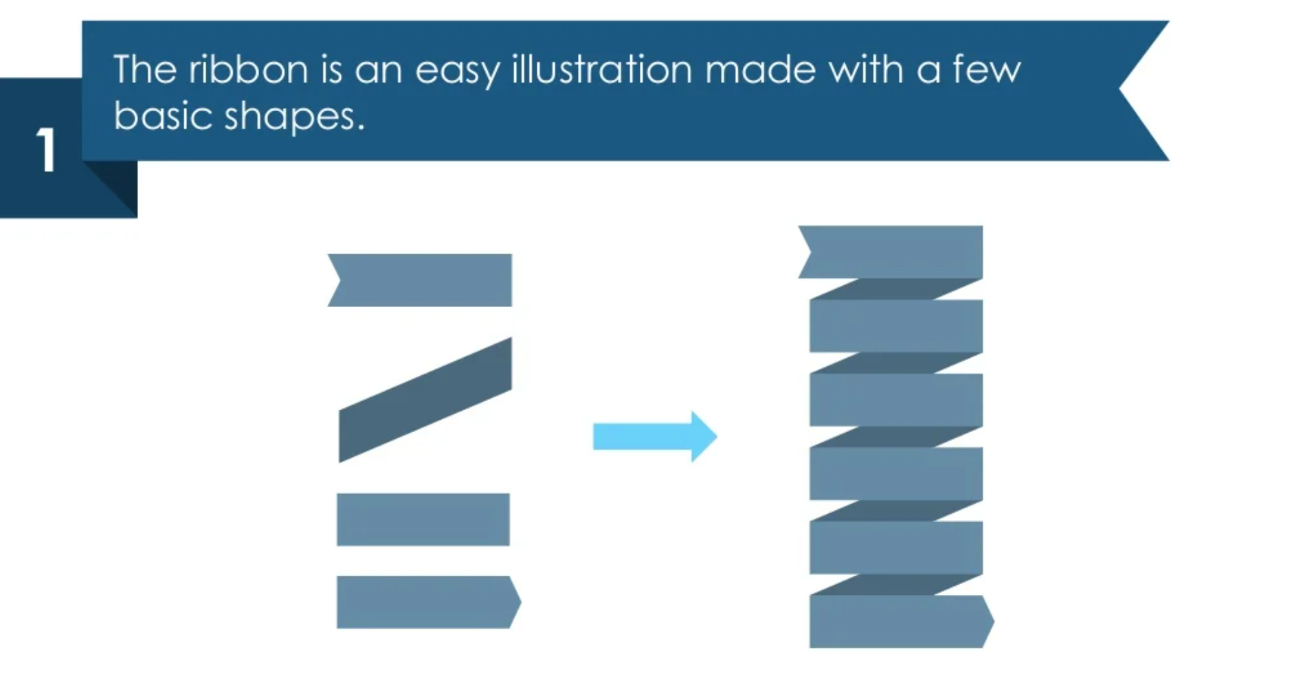
Step 1. Create a flowchart ribbon
Start adding several basic PPT shapes, which you will merge all together to form a ribbon shape.
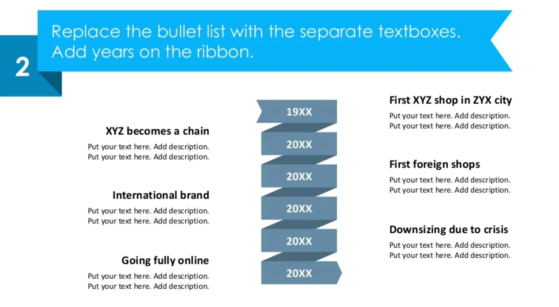
Step 2. Ditch the bullet points
Bullet points can be handy when you want to explain something very brief, but in this case, you are focusing on counting your company’s achievements. Adding textboxes will look cleaner.
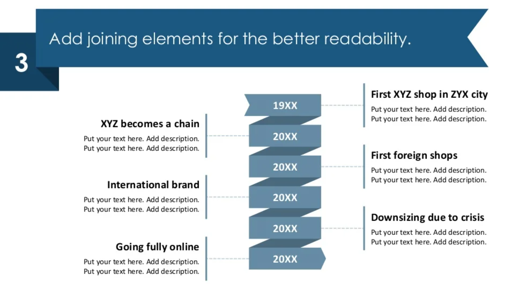
Step 3. Add joining elements
Now, you want to direct every description to the corresponding year for better readability and understanding. You can achieve this by adding joining elements, such as line vectors and dashed lines.
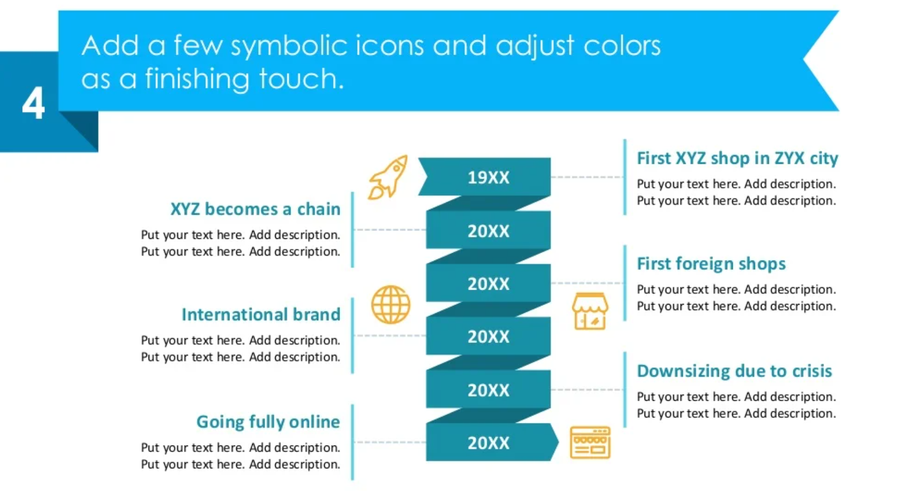
Step 4. Add icons and color for a design touch
In our opinion, colors and icons in a presentation are like putting a topcoat after fresh paint! Add some representative icons for a better association, and color-coding to break the monotony of your slide.
And, you’re all set! Here’s a YouTube tutorial that you may find useful.
If you need a starting point for creating presentations by yourself, check out this free sample with different icons and diagrams which you can adjust as you please.
Source
The slide makeover we used here, is part of the infoDiagram’s Established Company History Timeline Template collection. You can find more slide ideas there.
Check this blog out to see how to present a company timeline with different diagram graphics.
Recent Posts

The Importance of a Spell Checking in PowerPoint Presentations
As a designer, I can write long posts about the importance of good design on slides 🙂 However, one aspect that is often overlooked but equally important is the accuracy of text on a slide. Typos and spelling errors can undermine your credibility, distract your audience, and diminish the overall effectiveness of your presentation. Let […]

Introduction to Align & Distribute PowerPoint Tools
In the realm of PowerPoint presentations, the visual aspect plays a crucial role in conveying information effectively. Proper alignment can bring order, consistency, and polish to your presentation. In this post, I’ll explore the importance of alignment in PowerPoint and introduce you to the Align & Distribute tools that can take your slide design to […]

The Most Common Mistakes in a Presentation to Avoid
Have you ever wondered what the most common mistakes are when preparing a PowerPoint presentation? Do you think you might be making these mistakes? Let’s find out. I have prepared a list of the most common mistakes made on slides for you:

Slide Redesign: Presenting Business Values with a Radar Chart
Let’s talk a little about charts in PowerPoint 🙂 Have you ever used a specific chart type called radar? I bet your answer is NO or RARELY and I’m not surprised. The most common charts used in PowerPoint presentations are bar charts and pie charts but I’d like to show you how to replace typical […]

Slide Redesign: Presenting the OKR Setting Process with a Timeline Flowchart
Today I’d like to show you how creatively you can replace a typical and not attractive table with a timeline flowchart. I chose the example of the OKR setting process which contains 3 steps and has quite a lot of text, so it’s a more difficult task because there is not much area to use […]

Slide Redesign: Presenting the Meeting Agenda with a Creative Timeline
I’d like to show you how you can creatively present your meeting agenda in PowerPoint. Creating a list of consecutive meeting sections is not enough to grasp your audience’s attention. If you present the agenda the boring way, it’s gonna be a signal to your participants that the meeting might be boring too. Content is […]

Slide Redesign: Presenting the List of NPS Benefits with a Creative Infographic
I’d like to show you an alternative way of presenting a list of the benefits in PowerPoint. Actually, a list doesn’t mean that text must be arranged in bullet points or numbers. This way of presenting content is so ordinary and common that slides with typical lists do not impress the audience. I will explain […]

What Fonts To Use In PowerPoint Presentation
What fonts are good to use, to make your slide look professional? Let us suggest you several font proposals and where to get them from.

7 Design Tips for Professional PowerPoint Slide
Here are some design best-practice rules to help you create a professional visual slides in PowerPoint:

Slide Redesign: Presenting the Process of Employer Branding with the Roadmap
Today I’d like to show you a redesign of a PowerPoint slide with a multistep process with subcategories. Probably the first version will be in a form of numbered text list presenting each step. Yes, you can create it that way, but we’d like to make our slide look more attractive visually. I will work […]

Slide Redesign: Project Launch Stages Illustrated with Activities Icons
Do you present the launch stages of your project? The easiest way to present stages is to use a number or bullet list. But it’s a common and boring solution. Let’s try to avoid using a typical PowerPoint list and instead of it let’s make a creative slide. In today’s case study, we’re going to […]

Slide Redesign: Presenting Team or Contact Persons
Do you need to present in your pitch deck the key persons to contact? The easiest way to show your team on the slide is to put the data into the table. But we don’t want to use a typical table that we know from Excel. Let’s create an interesting infographic in PowerPoint on the […]

Slide Design: BCG Comparison Matrix in PowerPoint
Do you need to compare several options over two criteria? Try to use a matrix visual form. To create such a matrix comparison in your presentation you don’t need any special software for that. You can do it very easily in PowerPoint. And such a matrice can look very attractive. I’m going to illustrate it […]

Slide Redesign: Checklist in PowerPoint on Due Diligence Example
Do you need to present a checklist of some kind? In today’s blog, we will give you some directions on how to redesign a checklist type of slide content, on the example of legal due diligence. But first, let’s see why we have optioned a checklist, rather than a standard bullet point text.

Slide Redesign: Use Road Signs Graphics for Rule Incorporation
Do you need to express rules, regulations or dos and don’ts on a slide? Consider illustrating your points with a visual metaphor everybody recognizes – traffic signs. Adding such graphics will help you to pass a clear message while having the audience’s full attention thanks to the symbols. Let’s see how we can redesign a […]