
Are you hiring a talented workforce internationally, or are you simply implementing a hybrid/work-from-home model? No matter your goal, remote work has either way proven beneficial since the pandemic.
However, this mode has shown to be challenging regarding work ethics for some people. Therefore, it’s important to educate your employees on remote work principles. If you want to create rules, it’s handy to clearly accentuate the basic do’s and don’ts rules.
Presenting such information in a standard table will look intimidating, so we replaced the boring-looking tables with catchy visuals for sending a clear message, and keeping the reader engaged.
The Remote Work PPT Slide Before the Redesign
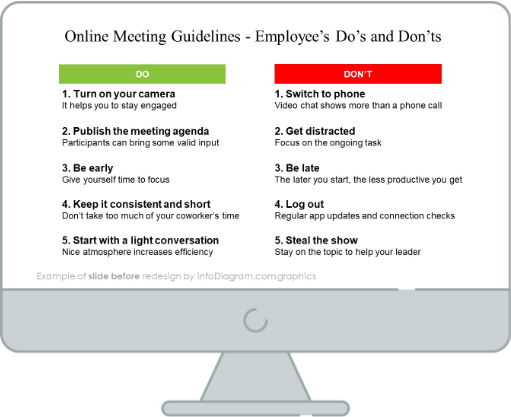
This is a standard table presentation that looks boring and intimidating. What’s more, no one will remember 10 rules written with plain text. There’s no catchy element or symbols which will draw attention. So let’s see what a more modern visual slide should look like.
The Remote Work PPT Slide After the Redesign
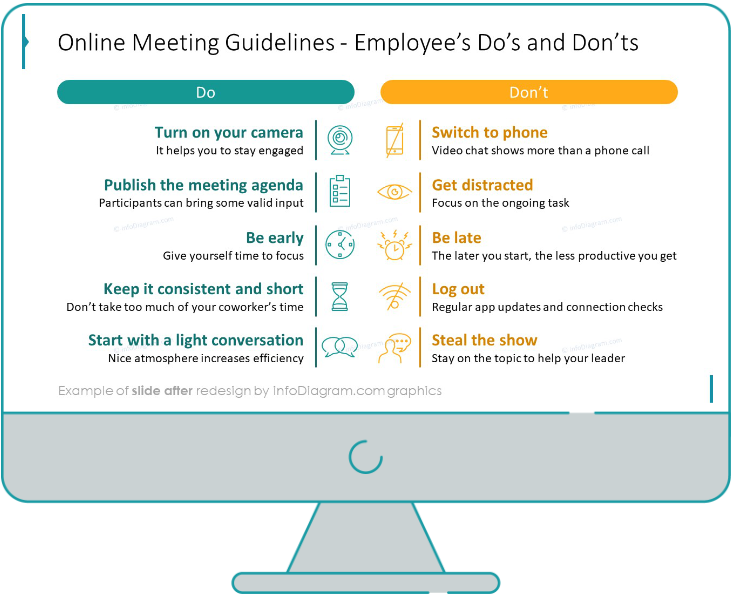
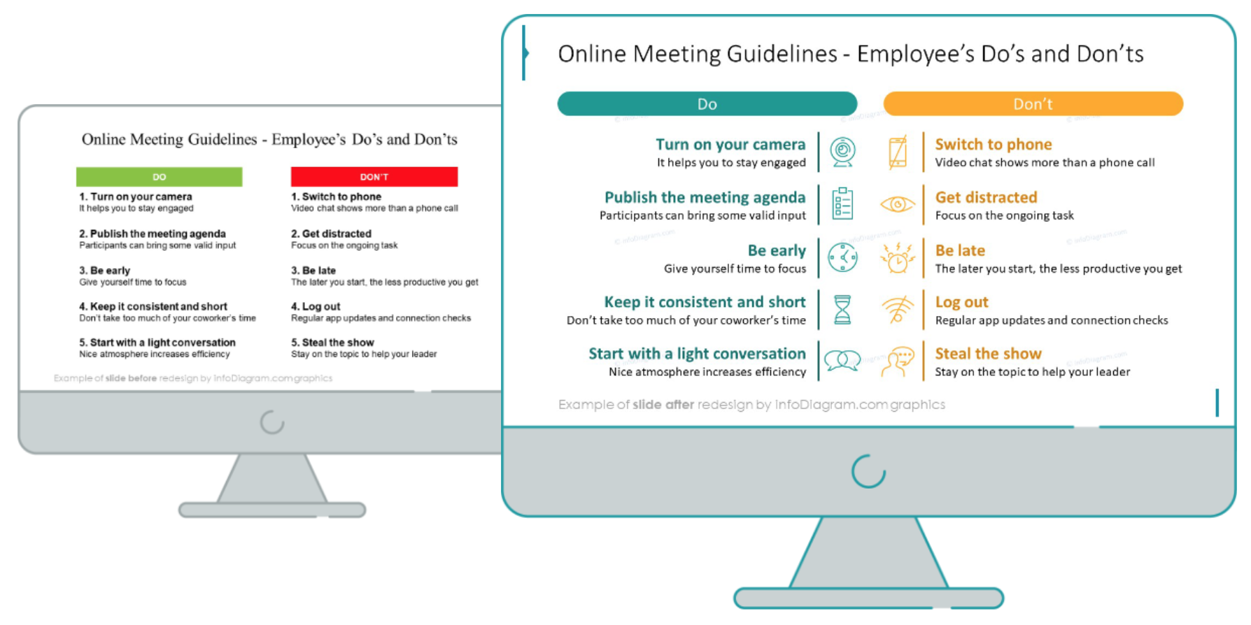
When we compare them together, we can see that the redesigned slide looks much more appealing, and engaging, and has enough elements proportionally distributed throughout the whole slide.
Below you can read more about the required redesign steps.
Before the redesign: Consider the visual form
Such slides with messages to employees or the audience should speak with symbols and colors. Think for a while of the way of enriching the plain text from the table with symbols, colors, or icons.
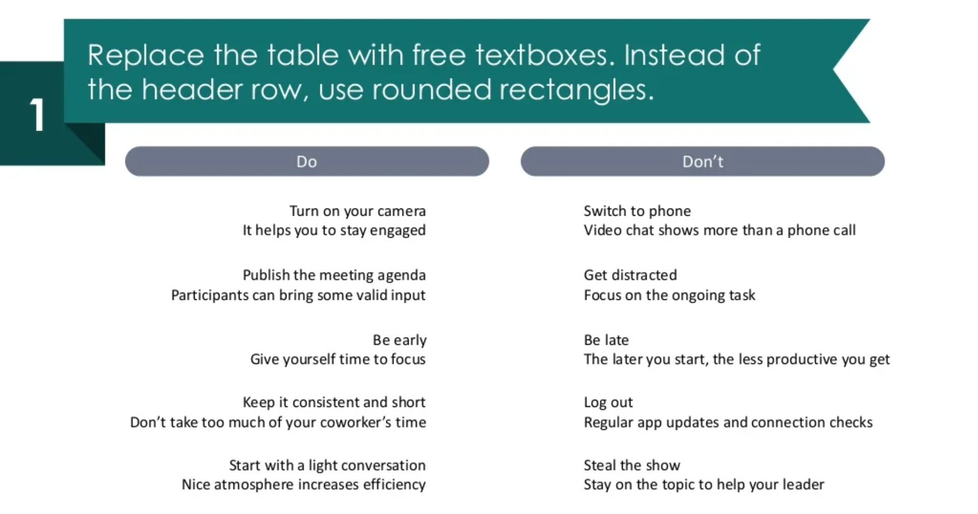
Step 1. Replace the table with text boxes
As we mentioned previously, instead of a table, add free text boxes, it gives more options for decorating headers (you’re not restricted to editing only the table’s options) eg. replace simple headers with two rounded rectangles for the do’s and don’ts.
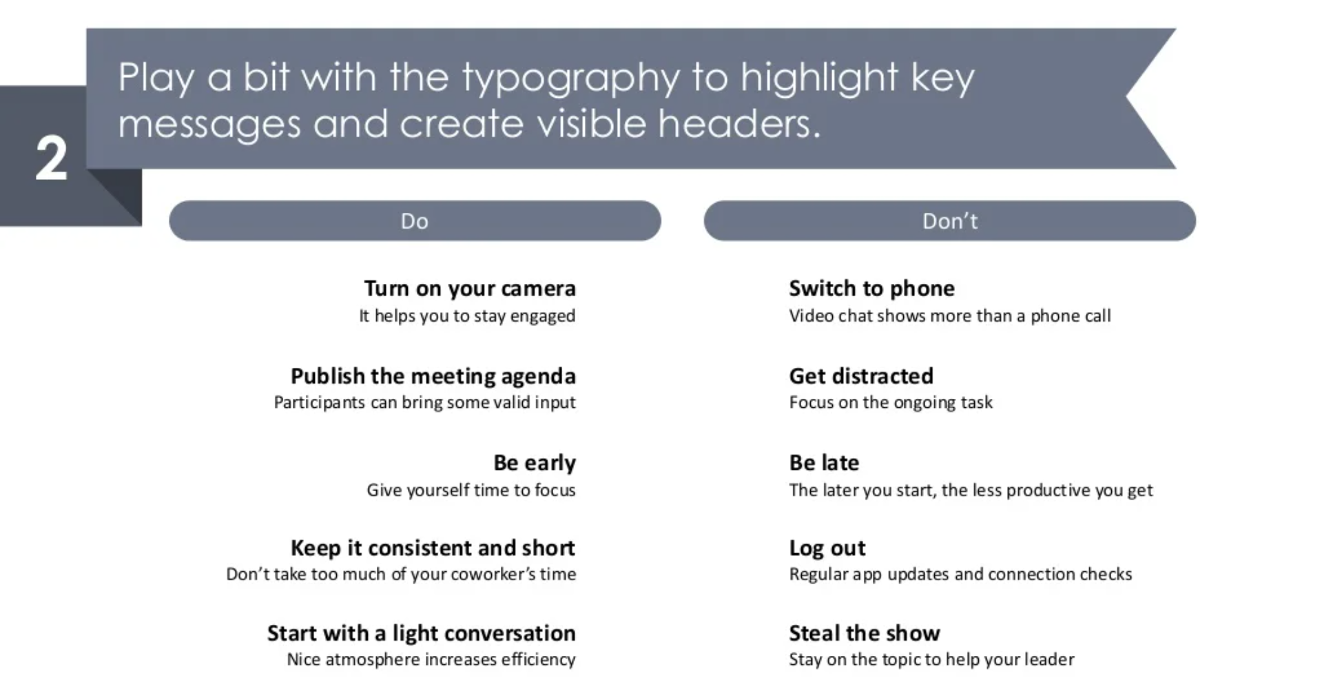
Step 2. Make the typography more catchy with highlights
Make your text more appealing and unique, by highlighting key points and creating more visible headers.
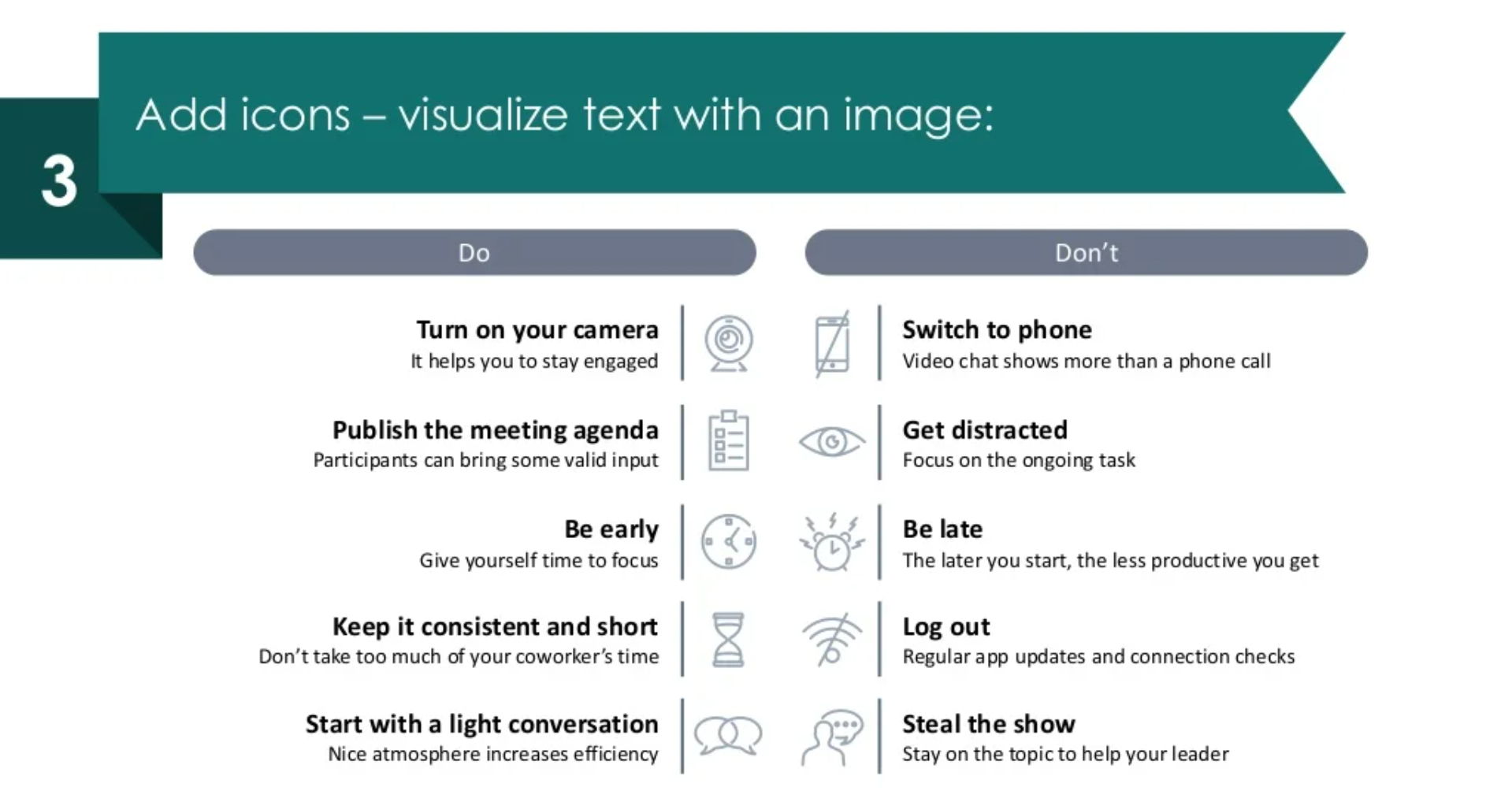
Step 3. Add representative icons for element-rich presentation
Make your slide more element-rich and easier to grasp by adding representative icons for each of the key points.
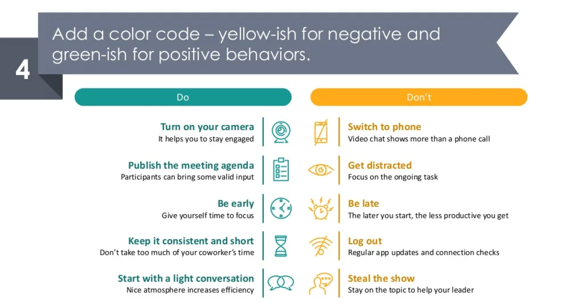
Step 4. Color-coding will contribute to the distinguishment of the elements
As a final step, add colors to make the positive and negative behaviors easier to distinguish. In our case, we added dark turquoise color for do’s, and a yellow-orange tone for the don’ts.
I hope you had fun reading this, and that it initiated some interesting ideas for your next presentation.
Here’s a YouTube Video Illustration for more illustration ideas.
Still not sure how to make a good-looking presentation? No worries, you can download this free sample kit to practice your designing skills to perfection! Go ahead and check it out.
Sources
The graphics we used in this blog, are the property of infoDiagram’s Remote Work Know-how Infographics collection. Check there for more slides.
You may also like this blog on How to Use Attention-Grabbing Graphics in Presentations.
Recent Posts

The Importance of a Spell Checking in PowerPoint Presentations
As a designer, I can write long posts about the importance of good design on slides 🙂 However, one aspect that is often overlooked but equally important is the accuracy of text on a slide. Typos and spelling errors can undermine your credibility, distract your audience, and diminish the overall effectiveness of your presentation. Let […]

Introduction to Align & Distribute PowerPoint Tools
In the realm of PowerPoint presentations, the visual aspect plays a crucial role in conveying information effectively. Proper alignment can bring order, consistency, and polish to your presentation. In this post, I’ll explore the importance of alignment in PowerPoint and introduce you to the Align & Distribute tools that can take your slide design to […]

The Most Common Mistakes in a Presentation to Avoid
Have you ever wondered what the most common mistakes are when preparing a PowerPoint presentation? Do you think you might be making these mistakes? Let’s find out. I have prepared a list of the most common mistakes made on slides for you:

Slide Redesign: Presenting Business Values with a Radar Chart
Let’s talk a little about charts in PowerPoint 🙂 Have you ever used a specific chart type called radar? I bet your answer is NO or RARELY and I’m not surprised. The most common charts used in PowerPoint presentations are bar charts and pie charts but I’d like to show you how to replace typical […]

Slide Redesign: Presenting the OKR Setting Process with a Timeline Flowchart
Today I’d like to show you how creatively you can replace a typical and not attractive table with a timeline flowchart. I chose the example of the OKR setting process which contains 3 steps and has quite a lot of text, so it’s a more difficult task because there is not much area to use […]

Slide Redesign: Presenting the Meeting Agenda with a Creative Timeline
I’d like to show you how you can creatively present your meeting agenda in PowerPoint. Creating a list of consecutive meeting sections is not enough to grasp your audience’s attention. If you present the agenda the boring way, it’s gonna be a signal to your participants that the meeting might be boring too. Content is […]

Slide Redesign: Presenting the List of NPS Benefits with a Creative Infographic
I’d like to show you an alternative way of presenting a list of the benefits in PowerPoint. Actually, a list doesn’t mean that text must be arranged in bullet points or numbers. This way of presenting content is so ordinary and common that slides with typical lists do not impress the audience. I will explain […]

What Fonts To Use In PowerPoint Presentation
What fonts are good to use, to make your slide look professional? Let us suggest you several font proposals and where to get them from.

7 Design Tips for Professional PowerPoint Slide
Here are some design best-practice rules to help you create a professional visual slides in PowerPoint:

Slide Redesign: Presenting the Process of Employer Branding with the Roadmap
Today I’d like to show you a redesign of a PowerPoint slide with a multistep process with subcategories. Probably the first version will be in a form of numbered text list presenting each step. Yes, you can create it that way, but we’d like to make our slide look more attractive visually. I will work […]

Slide Redesign: Project Launch Stages Illustrated with Activities Icons
Do you present the launch stages of your project? The easiest way to present stages is to use a number or bullet list. But it’s a common and boring solution. Let’s try to avoid using a typical PowerPoint list and instead of it let’s make a creative slide. In today’s case study, we’re going to […]

Slide Redesign: Presenting Team or Contact Persons
Do you need to present in your pitch deck the key persons to contact? The easiest way to show your team on the slide is to put the data into the table. But we don’t want to use a typical table that we know from Excel. Let’s create an interesting infographic in PowerPoint on the […]

Slide Design: BCG Comparison Matrix in PowerPoint
Do you need to compare several options over two criteria? Try to use a matrix visual form. To create such a matrix comparison in your presentation you don’t need any special software for that. You can do it very easily in PowerPoint. And such a matrice can look very attractive. I’m going to illustrate it […]

Slide Redesign: Checklist in PowerPoint on Due Diligence Example
Do you need to present a checklist of some kind? In today’s blog, we will give you some directions on how to redesign a checklist type of slide content, on the example of legal due diligence. But first, let’s see why we have optioned a checklist, rather than a standard bullet point text.

Slide Redesign: Use Road Signs Graphics for Rule Incorporation
Do you need to express rules, regulations or dos and don’ts on a slide? Consider illustrating your points with a visual metaphor everybody recognizes – traffic signs. Adding such graphics will help you to pass a clear message while having the audience’s full attention thanks to the symbols. Let’s see how we can redesign a […]