
The 30 60 90 day plan is an excellent strategy for describing an onboarding process or any action strategy. If you are a manager who has an upcoming interview and wants to explain the workflow to a potential employee, having a simple and understanding presentation prepared, can help you demonstrate the company’s principles in a concise way.
This plan can actually be used the other way around too: a potential employee explains to the recruiter, the contributions he’d make as a new hire.
So, no matter the role you are in, we created a universal editable 30 60 90 day plan template, that you can adjust according to your needs.
Follow the article to see how we replaced the typical common table with an attractive graphic.
The 30 60 90 Day Plan Slide Before the Redesign
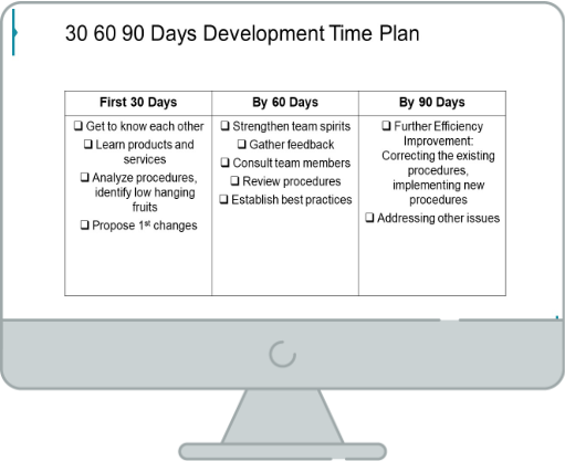
Our source slide here uses a generic table with old-fashioned looking bullet points. As a result, the slide looks more like a standard Word document rather than a presentation. An engaging presentation should contain graphic elements and illustrations in a way to still deliver a concise message.
Let’s see visually what the slide should look like.
The 30 60 90 Day Plan Slide After the Redesign
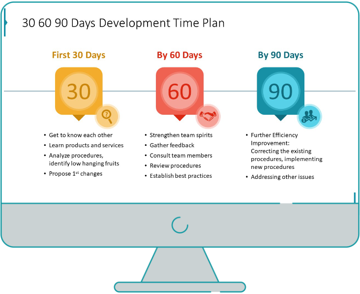
Source: infoDiagram’s Visual 30-60-90 Day Action Plan PPT Template
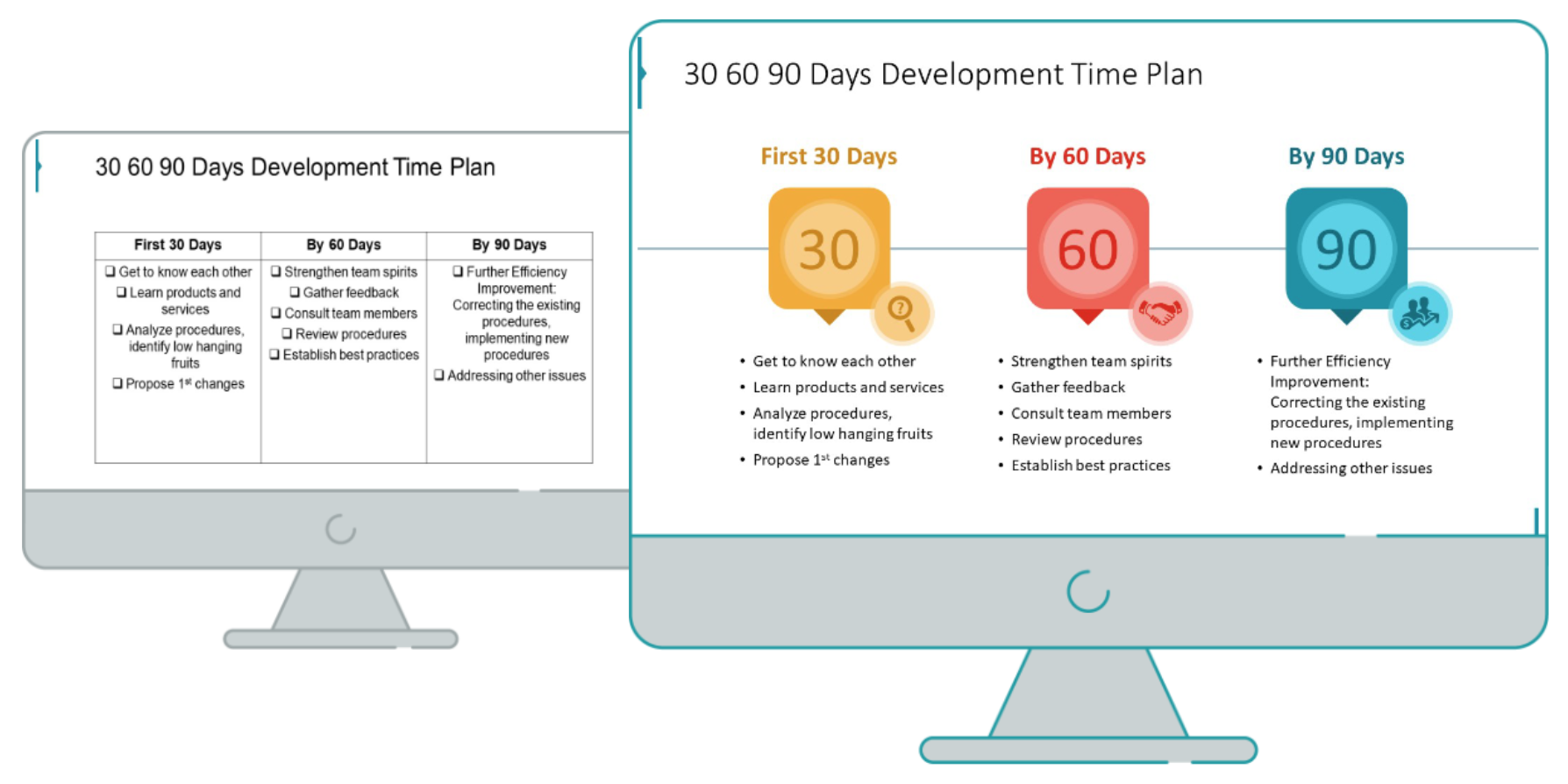
Notice the difference! When compared together, we can see how the redesigned slide looks more element-rich and has a proportional space between the text and elements. It’s very important to keep equal margins on the slide. Following the good-design rules, the content can’t be to close to the edge. It makes slide overloaded.
The whole process requires only four steps which we’re explaining below.
Before Redesign: Consider the visual form
The source slide contains information in a form of a table with three columns. In this case, the table may not be the best form of visualization. A slide containing only three elements like the three stages of the 30-60-90 plan have a lot of space to use graphic elements.
Using PowerPoint shapes you can create much more attractive graphics.
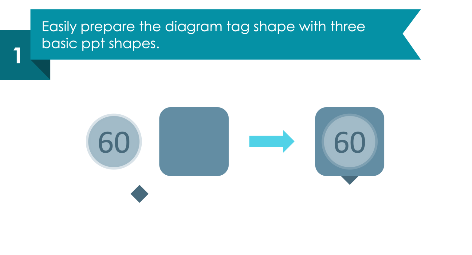
Step 1. Start by adding three basic PPT shapes
Add basic shapes like those in the picture – a flat circle with a number, a small rhomboid, and a square with rounded corners. Then, what you should do is, to merge them all together to create the final shape. Notice how we used a gradient gray color, to make all the elements visible.
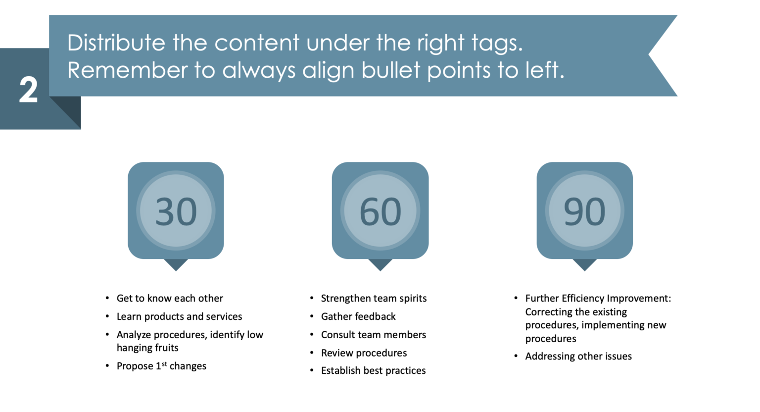
Step 2. Distribute your text under the tags
Now, after you added the 30, 60, and 90 tags, write down your strategy goals under bullet points. Ideally, align the bullet points to the left for greater effectiveness. Worth to remember: do not use other shapes for bullet points than dots.
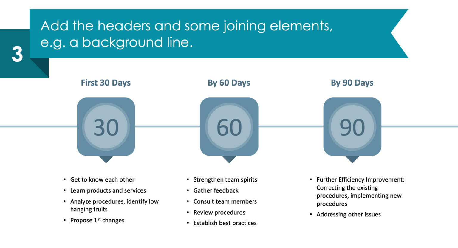
Step 3. Add the headers and a linking element
Put your headers above every tag, and link them with a simple element – a straight vector line would do the job great.
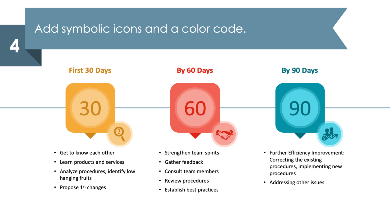
Step 4. Beautify your slide with icons and colors
As a final step, add several representative icons and colors to make your slide more visually appealing. Our idea was a magnifying glass icon symbolizing research, getting acquainted, and general analysis, a handshake for collaboration, and a prosperity icon for, as you guess – prosperity! With those symbols you make your content easier to remember by the audience.
I hope you find this guide useful and that it sparked some ideas for your next presentation.
Check out this YouTube tutorial where you can find more slide infographic illustrations: 👇
Go and download this free sample deck, with colorful diagrams and associative icons, and become a master in designing presentations in no time!
Source
The slide redesign guide we used in this blog is an inspiration from infoDiagram’s 30 60 90 Day Action Plan Template. The whole deck contains 16 slides, 12 diagrams, and 12 icons (all fully editable).
Additionally, this blog may help you to choose the right slide based on your needs.
Recent Posts

The Importance of a Spell Checking in PowerPoint Presentations
As a designer, I can write long posts about the importance of good design on slides 🙂 However, one aspect that is often overlooked but equally important is the accuracy of text on a slide. Typos and spelling errors can undermine your credibility, distract your audience, and diminish the overall effectiveness of your presentation. Let […]

Introduction to Align & Distribute PowerPoint Tools
In the realm of PowerPoint presentations, the visual aspect plays a crucial role in conveying information effectively. Proper alignment can bring order, consistency, and polish to your presentation. In this post, I’ll explore the importance of alignment in PowerPoint and introduce you to the Align & Distribute tools that can take your slide design to […]

The Most Common Mistakes in a Presentation to Avoid
Have you ever wondered what the most common mistakes are when preparing a PowerPoint presentation? Do you think you might be making these mistakes? Let’s find out. I have prepared a list of the most common mistakes made on slides for you:

Slide Redesign: Presenting Business Values with a Radar Chart
Let’s talk a little about charts in PowerPoint 🙂 Have you ever used a specific chart type called radar? I bet your answer is NO or RARELY and I’m not surprised. The most common charts used in PowerPoint presentations are bar charts and pie charts but I’d like to show you how to replace typical […]

Slide Redesign: Presenting the OKR Setting Process with a Timeline Flowchart
Today I’d like to show you how creatively you can replace a typical and not attractive table with a timeline flowchart. I chose the example of the OKR setting process which contains 3 steps and has quite a lot of text, so it’s a more difficult task because there is not much area to use […]

Slide Redesign: Presenting the Meeting Agenda with a Creative Timeline
I’d like to show you how you can creatively present your meeting agenda in PowerPoint. Creating a list of consecutive meeting sections is not enough to grasp your audience’s attention. If you present the agenda the boring way, it’s gonna be a signal to your participants that the meeting might be boring too. Content is […]

Slide Redesign: Presenting the List of NPS Benefits with a Creative Infographic
I’d like to show you an alternative way of presenting a list of the benefits in PowerPoint. Actually, a list doesn’t mean that text must be arranged in bullet points or numbers. This way of presenting content is so ordinary and common that slides with typical lists do not impress the audience. I will explain […]

What Fonts To Use In PowerPoint Presentation
What fonts are good to use, to make your slide look professional? Let us suggest you several font proposals and where to get them from.

7 Design Tips for Professional PowerPoint Slide
Here are some design best-practice rules to help you create a professional visual slides in PowerPoint:

Slide Redesign: Presenting the Process of Employer Branding with the Roadmap
Today I’d like to show you a redesign of a PowerPoint slide with a multistep process with subcategories. Probably the first version will be in a form of numbered text list presenting each step. Yes, you can create it that way, but we’d like to make our slide look more attractive visually. I will work […]

Slide Redesign: Project Launch Stages Illustrated with Activities Icons
Do you present the launch stages of your project? The easiest way to present stages is to use a number or bullet list. But it’s a common and boring solution. Let’s try to avoid using a typical PowerPoint list and instead of it let’s make a creative slide. In today’s case study, we’re going to […]

Slide Redesign: Presenting Team or Contact Persons
Do you need to present in your pitch deck the key persons to contact? The easiest way to show your team on the slide is to put the data into the table. But we don’t want to use a typical table that we know from Excel. Let’s create an interesting infographic in PowerPoint on the […]

Slide Design: BCG Comparison Matrix in PowerPoint
Do you need to compare several options over two criteria? Try to use a matrix visual form. To create such a matrix comparison in your presentation you don’t need any special software for that. You can do it very easily in PowerPoint. And such a matrice can look very attractive. I’m going to illustrate it […]

Slide Redesign: Checklist in PowerPoint on Due Diligence Example
Do you need to present a checklist of some kind? In today’s blog, we will give you some directions on how to redesign a checklist type of slide content, on the example of legal due diligence. But first, let’s see why we have optioned a checklist, rather than a standard bullet point text.

Slide Redesign: Use Road Signs Graphics for Rule Incorporation
Do you need to express rules, regulations or dos and don’ts on a slide? Consider illustrating your points with a visual metaphor everybody recognizes – traffic signs. Adding such graphics will help you to pass a clear message while having the audience’s full attention thanks to the symbols. Let’s see how we can redesign a […]