
Do you need to present a list on a slide? In this blog, I will show you how to do it effectively and creatively without using typical for lists numbers or bullet points. I’m going to use an example of the presentation of talent management components. Even if you may not be working with human resources, this slide transformation can give you an idea of how to change any other slide that has a list of items.
It’s a no-brainer that every presentation should look appealing, simple, and element-rich, but most importantly, send a loud and clear message to the audience in a limited time.
We have turned a traditional-looking slide into an interesting infographic illustration.
The whole slide makeover required only four steps.
Talent Management Components Slide Before the Redesign

The displayed source slide looks very unengaging and bland. There aren’t any catchy elements that could trigger the interest of the audience. Also, the simple enumeration on a white background isn’t leaving the desired impression.
Let’s see now what the improved version looks like.
Talent Management Components Slide After the Redesign

The redesigned slide looks far more interesting and appealing. The colorful elements stand out, and yet everything looks well ordered and not over-stuffed.
Let’s compare them together now.

Evidently, the uplifted slide looks far better and stands out in a nice way, compared to the one on the left-hand side.
Keep following the next steps to see how we recreated the final version of the slide.
Step 1. Replace the enumeration with a diagram list
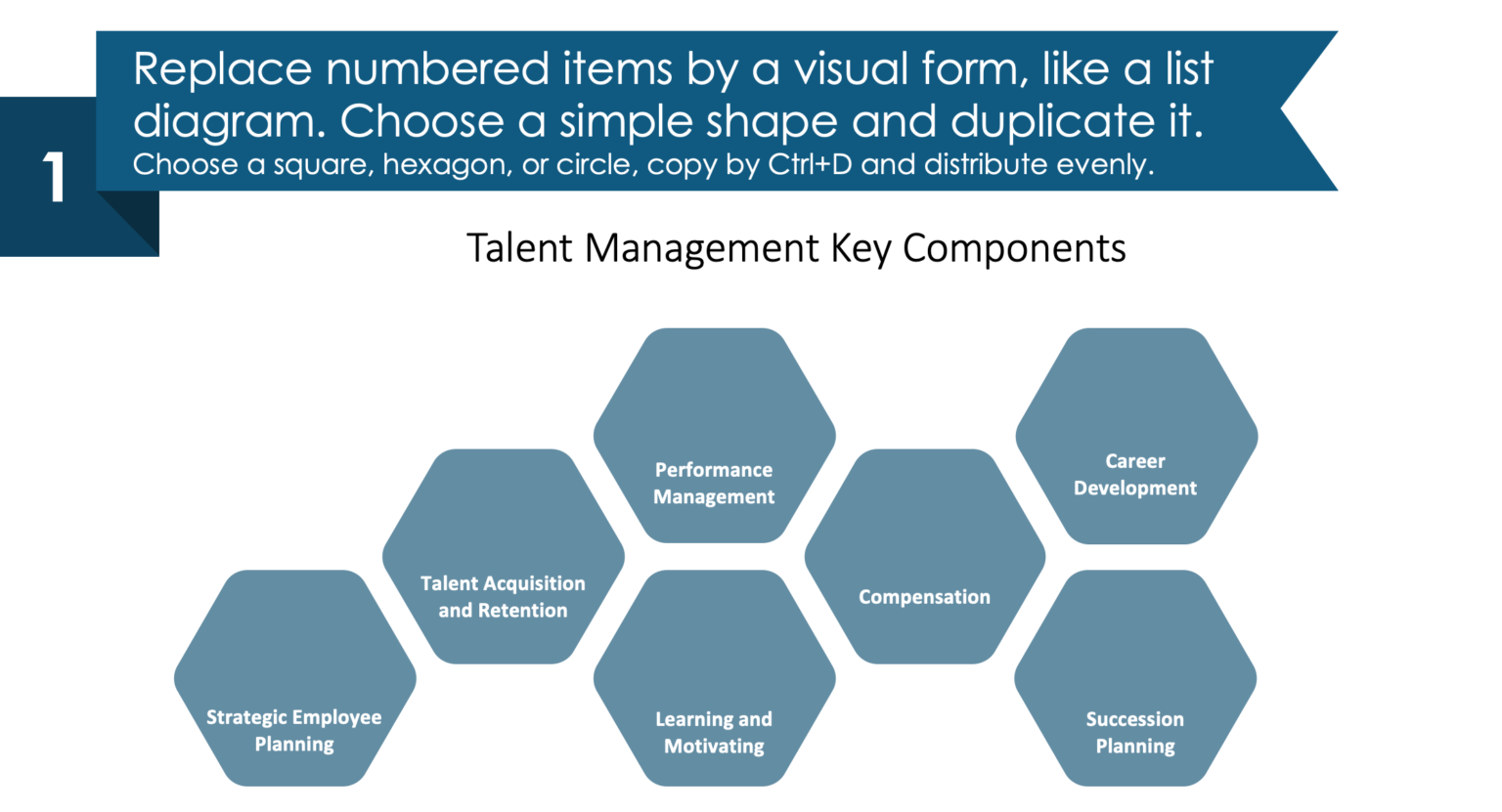
Bullet points, enumeration… it gets boring over time and kills the creativity. On that note, we have replaced this old-fashioned method with a hexagon diagram, distributed in a honeycomb form. It looks much cleaner, and the space is used just right.
Step 2. Add representative icons for each component
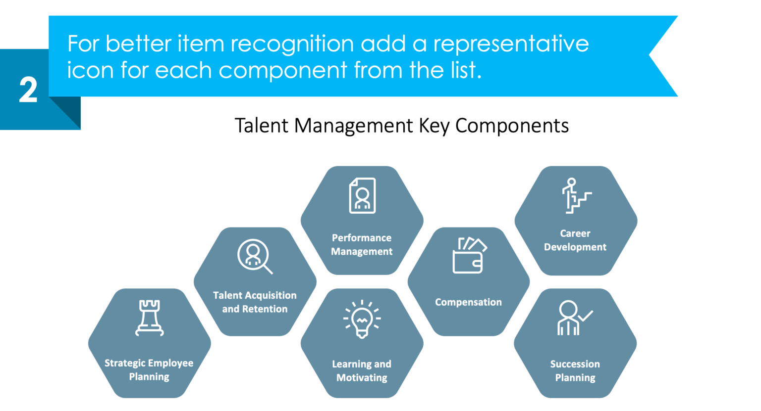
To give your audience a better understanding of the discussed topic, add representative icons to further emphasize and distinguish every talent management component.
Step 3. Enrich your slide with vivid colors
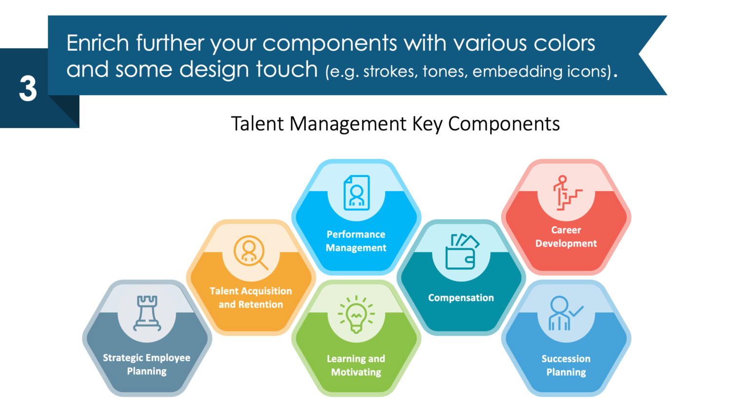
Make each of the diagram elements richer by adding different colors for every component.
Step 4. Add space for a description and comments
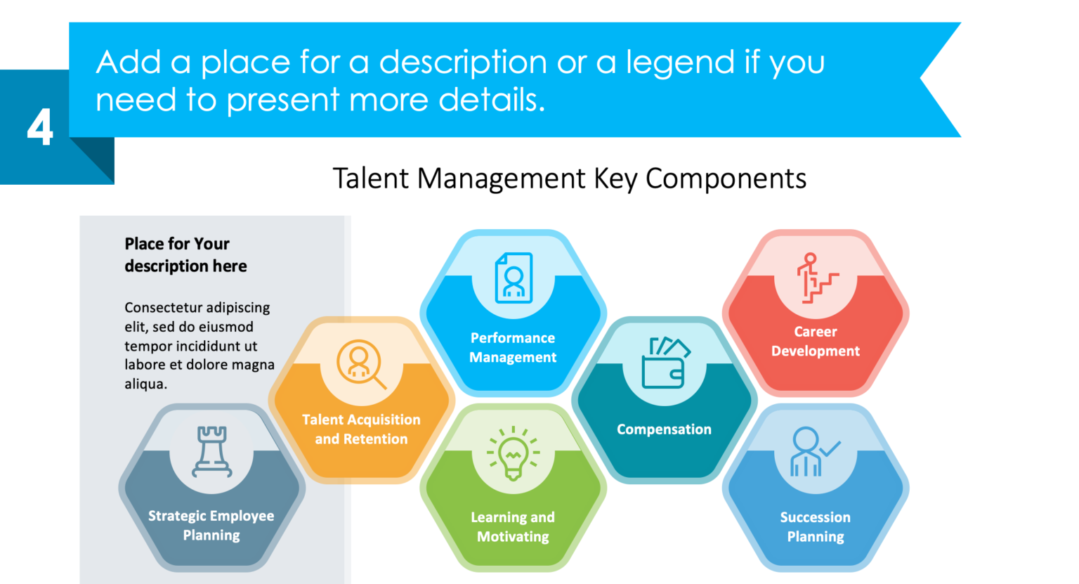
As a final step, leave some space (e.g. on the left-hand side) where you can put your comments and present more details.
I hope you find this guide useful and inspirational for your next presentation.
Want to do interesting slides by yourself? Try out this wonderful free sample kit!
For more HR Talent Management strategy makeovers, check our series of posts covering this topic.
Source
The graphic slide makeover used in this post is part of the infoDiagram HR Talent Management Presentation Template. Check there for more slide illustrations and creative ideas.
For more inspiration, check also this blog out.
Recent Posts

The Importance of a Spell Checking in PowerPoint Presentations
As a designer, I can write long posts about the importance of good design on slides 🙂 However, one aspect that is often overlooked but equally important is the accuracy of text on a slide. Typos and spelling errors can undermine your credibility, distract your audience, and diminish the overall effectiveness of your presentation. Let […]

Introduction to Align & Distribute PowerPoint Tools
In the realm of PowerPoint presentations, the visual aspect plays a crucial role in conveying information effectively. Proper alignment can bring order, consistency, and polish to your presentation. In this post, I’ll explore the importance of alignment in PowerPoint and introduce you to the Align & Distribute tools that can take your slide design to […]

The Most Common Mistakes in a Presentation to Avoid
Have you ever wondered what the most common mistakes are when preparing a PowerPoint presentation? Do you think you might be making these mistakes? Let’s find out. I have prepared a list of the most common mistakes made on slides for you:

Slide Redesign: Presenting Business Values with a Radar Chart
Let’s talk a little about charts in PowerPoint 🙂 Have you ever used a specific chart type called radar? I bet your answer is NO or RARELY and I’m not surprised. The most common charts used in PowerPoint presentations are bar charts and pie charts but I’d like to show you how to replace typical […]

Slide Redesign: Presenting the OKR Setting Process with a Timeline Flowchart
Today I’d like to show you how creatively you can replace a typical and not attractive table with a timeline flowchart. I chose the example of the OKR setting process which contains 3 steps and has quite a lot of text, so it’s a more difficult task because there is not much area to use […]

Slide Redesign: Presenting the Meeting Agenda with a Creative Timeline
I’d like to show you how you can creatively present your meeting agenda in PowerPoint. Creating a list of consecutive meeting sections is not enough to grasp your audience’s attention. If you present the agenda the boring way, it’s gonna be a signal to your participants that the meeting might be boring too. Content is […]

Slide Redesign: Presenting the List of NPS Benefits with a Creative Infographic
I’d like to show you an alternative way of presenting a list of the benefits in PowerPoint. Actually, a list doesn’t mean that text must be arranged in bullet points or numbers. This way of presenting content is so ordinary and common that slides with typical lists do not impress the audience. I will explain […]

What Fonts To Use In PowerPoint Presentation
What fonts are good to use, to make your slide look professional? Let us suggest you several font proposals and where to get them from.

7 Design Tips for Professional PowerPoint Slide
Here are some design best-practice rules to help you create a professional visual slides in PowerPoint:

Slide Redesign: Presenting the Process of Employer Branding with the Roadmap
Today I’d like to show you a redesign of a PowerPoint slide with a multistep process with subcategories. Probably the first version will be in a form of numbered text list presenting each step. Yes, you can create it that way, but we’d like to make our slide look more attractive visually. I will work […]

Slide Redesign: Project Launch Stages Illustrated with Activities Icons
Do you present the launch stages of your project? The easiest way to present stages is to use a number or bullet list. But it’s a common and boring solution. Let’s try to avoid using a typical PowerPoint list and instead of it let’s make a creative slide. In today’s case study, we’re going to […]

Slide Redesign: Presenting Team or Contact Persons
Do you need to present in your pitch deck the key persons to contact? The easiest way to show your team on the slide is to put the data into the table. But we don’t want to use a typical table that we know from Excel. Let’s create an interesting infographic in PowerPoint on the […]

Slide Design: BCG Comparison Matrix in PowerPoint
Do you need to compare several options over two criteria? Try to use a matrix visual form. To create such a matrix comparison in your presentation you don’t need any special software for that. You can do it very easily in PowerPoint. And such a matrice can look very attractive. I’m going to illustrate it […]

Slide Redesign: Checklist in PowerPoint on Due Diligence Example
Do you need to present a checklist of some kind? In today’s blog, we will give you some directions on how to redesign a checklist type of slide content, on the example of legal due diligence. But first, let’s see why we have optioned a checklist, rather than a standard bullet point text.

Slide Redesign: Use Road Signs Graphics for Rule Incorporation
Do you need to express rules, regulations or dos and don’ts on a slide? Consider illustrating your points with a visual metaphor everybody recognizes – traffic signs. Adding such graphics will help you to pass a clear message while having the audience’s full attention thanks to the symbols. Let’s see how we can redesign a […]