Categories
How to re-design slide

Slide Redesign: Euler Diagram for Presenting Overlapping Items

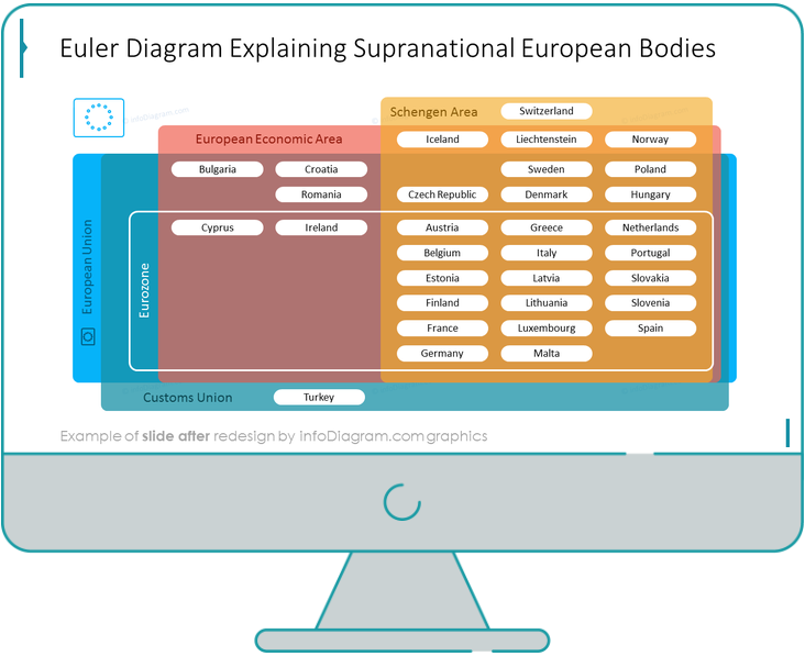
Do you need to present overlapping items or elements that have something in common? Giving such information can be quite messy and look unclean. The solution for that is simple – use diagrams!

There is a specific type of diagrammatic visualization that is great for presenting complex hierarchies or concepts that share similarities. They are called Euler diagrams.

In this guide, we will see how to convert a complex table into a clean-looking slide with an Euler Diagram illustration explaining the overlap between the supranational European bodies.

Categories
How to re-design slide

Slide Redesign: Financial Risks Pyramid

Presenting Investor Portfolio’s Risk Levels with a Pyramid Infographic

Do you need to present levels of financial risks? To create a memorable presentation, it’s good to use popular visual metaphors. In the case of risk levels, a pyramid can be a good candidate for a slide illustration. For that reason, we have prepared for you an example of a financial risk pyramid, presenting the issues in a hierarchical matter, from top to bottom.

Keep reading to see how we created this slide.

Categories
How to re-design slide

Slide Redesign: Replacing Bullet-Points in Gap Analysis List

Bullet points are the most common way of formatting text in PowerPoint. However, such a kind of text structure is quite boring for eyesight.

I’d like to show you how easily you can turn a typical bullet point slide into an interesting diagram. We’re going to use a slide representing types of gap analysis.