Categories
How to re-design slide

Slide Redesign: Project Launch Stages Illustrated with Activities Icons

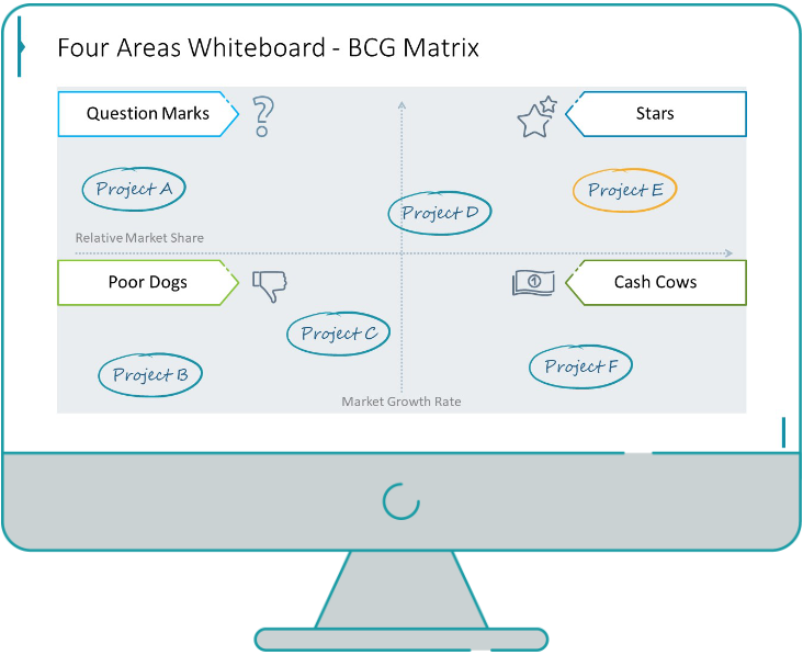
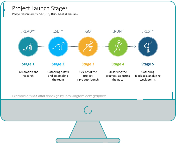
Do you present the launch stages of your project? The easiest way to present stages is to use a number or bullet list. But it’s a common and boring solution. Let’s try to avoid using a typical PowerPoint list and instead of it let’s make a creative slide. In today’s case study, we’re going to use people icons as visual metaphors.

So let’s see how we can transform a static list into an illustrative and dynamic diagram.

Categories
How to re-design slide

Slide Redesign: Presenting Team or Contact Persons

Do you need to present in your pitch deck the key persons to contact? The easiest way to show your team on the slide is to put the data into the table. But we don’t want to use a typical table that we know from Excel. Let’s create an interesting infographic in PowerPoint on the base of the table. It will make our content more attractive to your audience.

Let’s see a slide with a standard table before the redesign and how it can be enhanced easily on the example of the slide with organic shapes.

Categories
How to re-design slide

Slide Design: BCG Comparison Matrix in PowerPoint

Do you need to compare several options over two criteria? Try to use a matrix visual form. To create such a matrix comparison in your presentation you don’t need any special software for that. You can do it very easily in PowerPoint. And such a matrice can look very attractive. I’m going to illustrate it on example of the BCG matrix, used in consulting and investment areas.

Let’s see a slide version before the redesign and how it can be improved with a few steps.

Categories
How to re-design slide

Slide Redesign: Checklist in PowerPoint on Due Diligence Example

Do you need to present a checklist of some kind? In today’s blog, we will give you some directions on how to redesign a checklist type of slide content, on the example of legal due diligence.

But first, let’s see why we have optioned a checklist, rather than a standard bullet point text.

Categories
How to re-design slide

Slide Redesign: Use Road Signs Graphics for Rule Incorporation

Do you need to express rules, regulations or dos and don’ts on a slide? Consider illustrating your points with a visual metaphor everybody recognizes – traffic signs. Adding such graphics will help you to pass a clear message while having the audience’s full attention thanks to the symbols.

Let’s see how we can redesign a slide with a list of workplace regulations.

Categories
How to re-design slide

Slide Redesign: Use Visuals to Present Digital Transformation Strategy

Are you preparing a presentation for a digital transformation strategy, but you aren’t sure where to start? Presenting complex topics such as business strategy transformations can be very difficult to summarize in a simple slide containing only text because it won’t send the message in an understandable way.

Today in this blog post, we will explain how to solve this issue by using visual graphics to show the comparison of traditional to digital marketing as an example.

But first, let’s see what the “don’t” slide looks like.

Categories
How to re-design slide

Slide Redesign: Outlining Company Timeline With a Flowchart

Are you an established company dating back 10, 20, or even more years on the market? Do you need to outline your company timeline and achievements in a presentation, but you aren’t sure how?

Timelines are very often used in PowerPoint presentations. Well-prepared timeline is eye-catchy and easy to understand for the audience. With this post, I will show you how to tidy up your slides full of dates and text by using a flowchart diagram with only a few simple steps.

Categories
How to re-design slide

Slide Redesign: Do’s and Don’ts in Remote Work PPT

Are you hiring a talented workforce internationally, or are you simply implementing a hybrid/work-from-home model? No matter your goal, remote work has either way proven beneficial since the pandemic.

However, this mode has shown to be challenging regarding work ethics for some people. Therefore, it’s important to educate your employees on remote work principles. If you want to create rules, it’s handy to clearly accentuate the basic do’s and don’ts rules.

Presenting such information in a standard table will look intimidating, so we replaced the boring-looking tables with catchy visuals for sending a clear message, and keeping the reader engaged.

Categories
How to re-design slide

Slide Redesign: Creative 30 60 90 Day Plan for Strategy Planning

The 30 60 90 day plan is an excellent strategy for describing an onboarding process or any action strategy. If you are a manager who has an upcoming interview and wants to explain the workflow to a potential employee, having a simple and understanding presentation prepared, can help you demonstrate the company’s principles in a concise way.

This plan can actually be used the other way around too: a potential employee explains to the recruiter, the contributions he’d make as a new hire.

So, no matter the role you are in, we created a universal editable 30 60 90 day plan template, that you can adjust according to your needs.

Follow the article to see how we replaced the typical common table with an attractive graphic.

Categories
How to re-design slide

Slide Redesign: Euler Diagram for Presenting Overlapping Items

Do you need to present overlapping items or elements that have something in common? Giving such information can be quite messy and look unclean. The solution for that is simple – use diagrams!

There is a specific type of diagrammatic visualization that is great for presenting complex hierarchies or concepts that share similarities. They are called Euler diagrams.

In this guide, we will see how to convert a complex table into a clean-looking slide with an Euler Diagram illustration explaining the overlap between the supranational European bodies.