Categories
How to re-design slide

Slide Redesign: Listing Talent Management Components with a Hexagon Diagram

Do you need to present a list on a slide? In this blog, I will show you how to do it effectively and creatively without using typical for lists numbers or bullet points. I’m going to use an example of the presentation of talent management components. Even if you may not be working with human resources, this slide transformation can give you an idea of how to change any other slide that has a list of items.

It’s a no-brainer that every presentation should look appealing, simple, and element-rich, but most importantly, send a loud and clear message to the audience in a limited time.

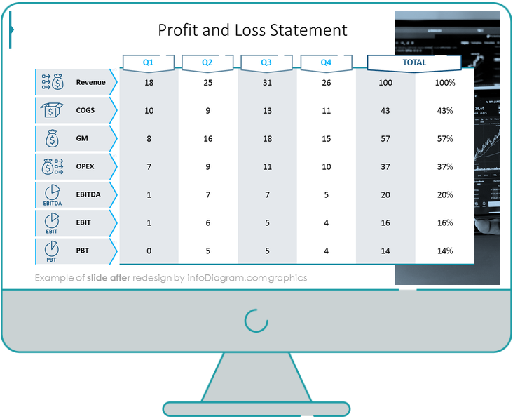
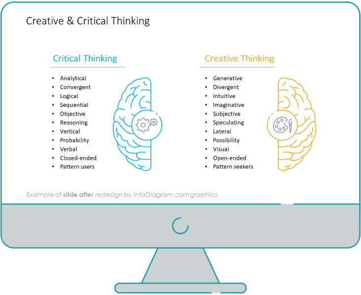
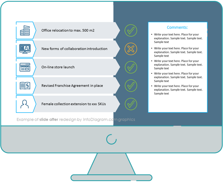
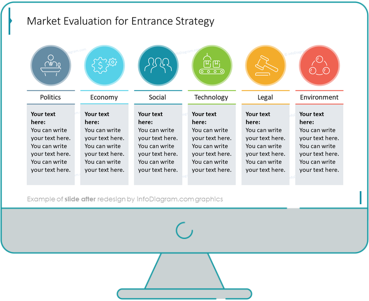
We have turned a traditional-looking slide into an interesting infographic illustration.

The whole slide makeover required only four steps.

Categories
How to re-design slide

Slide Redesign: Profit and Loss Statement Table Presentation

In this post, I will explain to you the way to design a nice Profit and Loss statement presentation with a financial table.

A standard financial report includes a series of tables with income statements, cash flow, balance sheet, equity changes, and liabilities. With this type of dense table, the information should be presented as simply as possible.

P&L Statement Table Slide Before the Makeover

profit and loss statement presentation slide with ppt graphics before redesign

Our source slide presented above looks old-fashioned and overwhelming. It’s also quite monotonous.

Let’s see now what the recreated slide version looks like.

Categories
How to re-design slide

Slide Redesign: Head and Brain Graphic Presentation

Are you interested in presenting customer behavior? Or generally any creative thinking or cognitive-related topic to your team? For your inspiration, we’ve prepared a design makeover example with a head and brain graphic presentation slide.

We try to share here effective presentation graphics that doesn’t acquire too much time and are rather simple to recreate on your own.

Categories
How to re-design slide

Slide Redesign: Yearly Marketing Plan with an Outline Table

Presenting the annual marketing activities plan can be quite overwhelming with the amount of information you need to pass to your audience. On that note, we have created for you an example of a yearly marketing plan makeover with an outline table, to help you send a loud and clear message, presented as simply as possible.

Table with Yearly Marketing Plan Before Redesign

Our source slide presented here looks pretty plain and boring. The calendar is average-looking and not very attractive for a marketing plan presentation.

Let’s look at the redesigned version now.

Yearly Marketing Plan Table After Design Update

yearly marketing plan with an outline table slide after the redesign
Source: infoDiagram Creative Presentation Tables and KPI Outline Design Template library

That’s quite an improvement now, isn’t it? We have replaced the standard old table, added different icons and elements, and as a result – we got a clean-looking table slide!

Categories
How to re-design slide

Slide Redesign: Annual Report with Goals Achievement Summary

Did you have a very successful business year and want to share this annual report with management? We have prepared for you the perfect goals achievement summary slide, with interesting infographics for an impactful presentation.

We always aim to make the best presentations for you, and hopefully this time won’t be any different. Once again, it requires only four simple steps.

Categories
How to re-design slide One-Pager in PowerPoint

Slide Redesign: Food Product One-Pager in PowerPoint

Too much text, too much information, and a lack of space – are the common mistakes on slides made in PowerPoint. So that’s why I’d like to show you how to briefly and clearly present your product. I’m going to use a one-pager with a food product sell sheet.

In the next steps, you will redesign a cluttered and illegible sheet into an engaging and transparent one-pager.

One-Pager with the food product before the redesign

Our source slide is full of unreadable text as the result of a lack of space and a lack of properly set margins.

Food Product Sell Sheet Presentation One Pager slide before redesign PowerPoint

Let’s check out what the final version looks like!

Categories
How to re-design slide

Slide Redesign: HR Metrics Dashboard

If you need to present human resources-related metrics, an organized data dashboard is a great way to display important aspects of HR performance indicators concisely. This will help your audience quickly gain insights into the presented data.

For inspiration and ideas on how to recreate an appealing HR Metrics Dashboard slide, read on.

Categories
How to re-design slide

Slide Redesign: Presenting PESTLE Analysis with a Modern List Layout

Do you need to prepare a strategy for entering a new market? Present it using a PESTLE analysis when talking to your investors or management board.

Let’s see a redesign case study on how you can make such a presentation more impactful. Replace the standard bullet points format and stuffed text with a modern-looking infographics slide.

Categories
How to re-design slide One-Pager in PowerPoint

Slide Redesign: Physical Product One-Pager Leaflet

The one-pager leaflet is a really popular and useful format. If you’re offering a product, it lets you to present it briefly. We’d like to show you how to create such one-pager in eye-catchy way. So check out this blog to see how we recreated a physical (non-digital) product one-pager slide from scratch.

Do you know that for creating such a graphical flyer you don’t always need advanced design software? A PowerPoint will do, too. See our guide of transforming the presentation slide into a fully graphical leaflet.

Categories
How to re-design slide

Slide Redesign: Metrics Table of Triple Bottom Line Sustainable Strategy

Have you ever worked with tables in PowerPoint? We work with them often, this time it’s a table with sustainability strategy content. And you know, your final effect doesn’t have to look like a commonly known, typical table. I’d like you to see how we turned a slide presenting metrics of John Elkington’s triple bottom line sustainable strategy concept into a creative illustration.

We have replaced the standard table content with simple elegant graphics.