
Do you need to present upcoming goals and each member’s role to your team? A well-patterned to-do checklist table might be the best solution and easiest to follow.
You can make a to-do checklist in PowerPoint from scratch, and if you don’t know how – we got you covered!
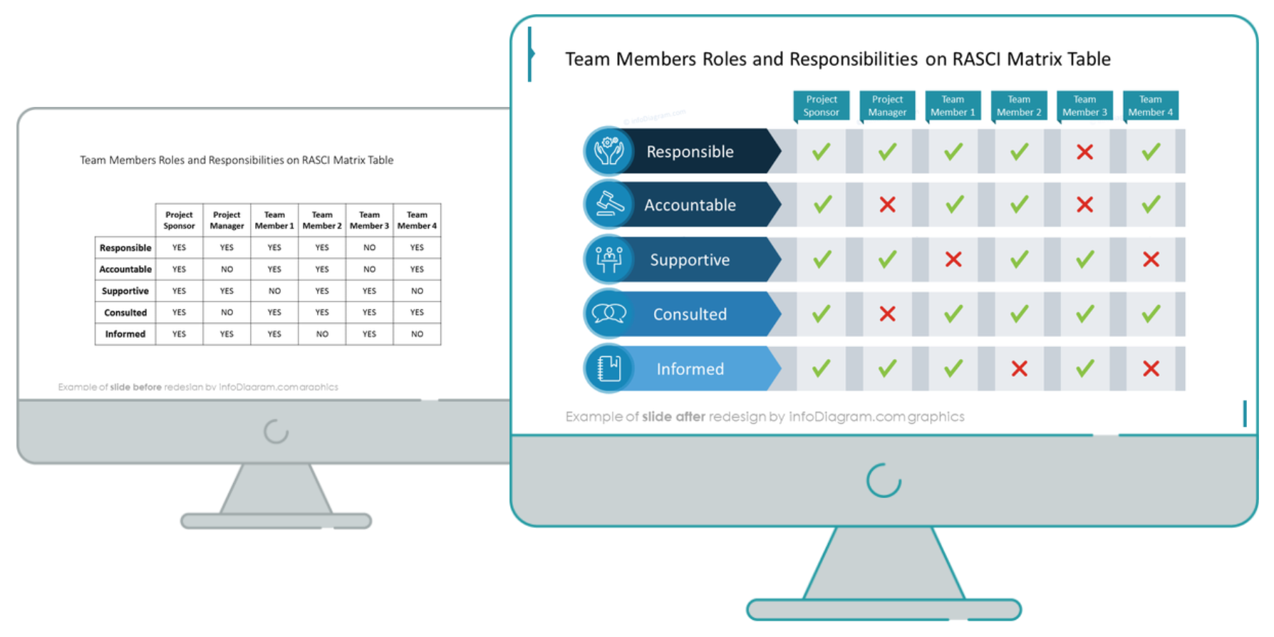
Keep reading to see how we redesigned a RASCI matrix table with a simple list slide into a sleek checklist with graphics and icons.
To-Do Checklist Before the Redesign
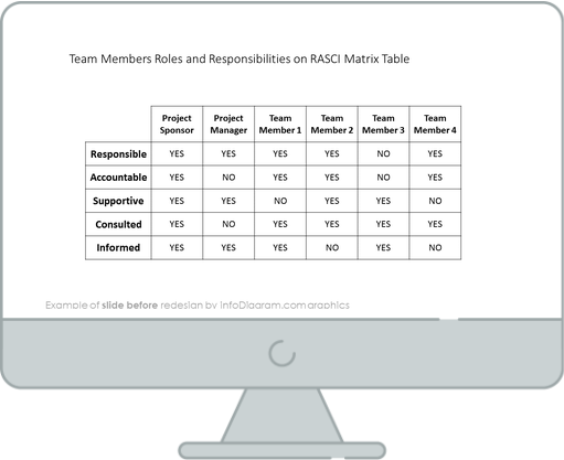
Our source slide looks very simple, colorless, and boring. The average-looking table looks stuffed with information, and it doesn’t contain any attractive elements. It’s hard to quickly recognize the difference between Yes and No, as those key values are just represented as a non-attractive text.
However, with a few design moves, you can create a much more interesting table-like grid, using PowerPoint shapes.
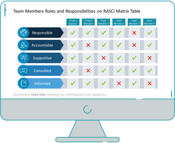
The To-Do Checklist Slide After the Redesign
Below we present an end result – a checklist table that is more visual. You can spot right away which team member has which role in the RASCI matrix.
Source: infoDiagram To-Do Checklist Presentation Graphics library
When we compare both slides, it’s no doubt that the redesigned one looks much better, and doesn’t lack color. The associative icons for each of the RASCI roles category (RASCI stands for those 5 roles: Responsible, Accountable, Supportive, Consulted, and Informed) are giving the final nice touch and help to better understand those roles.
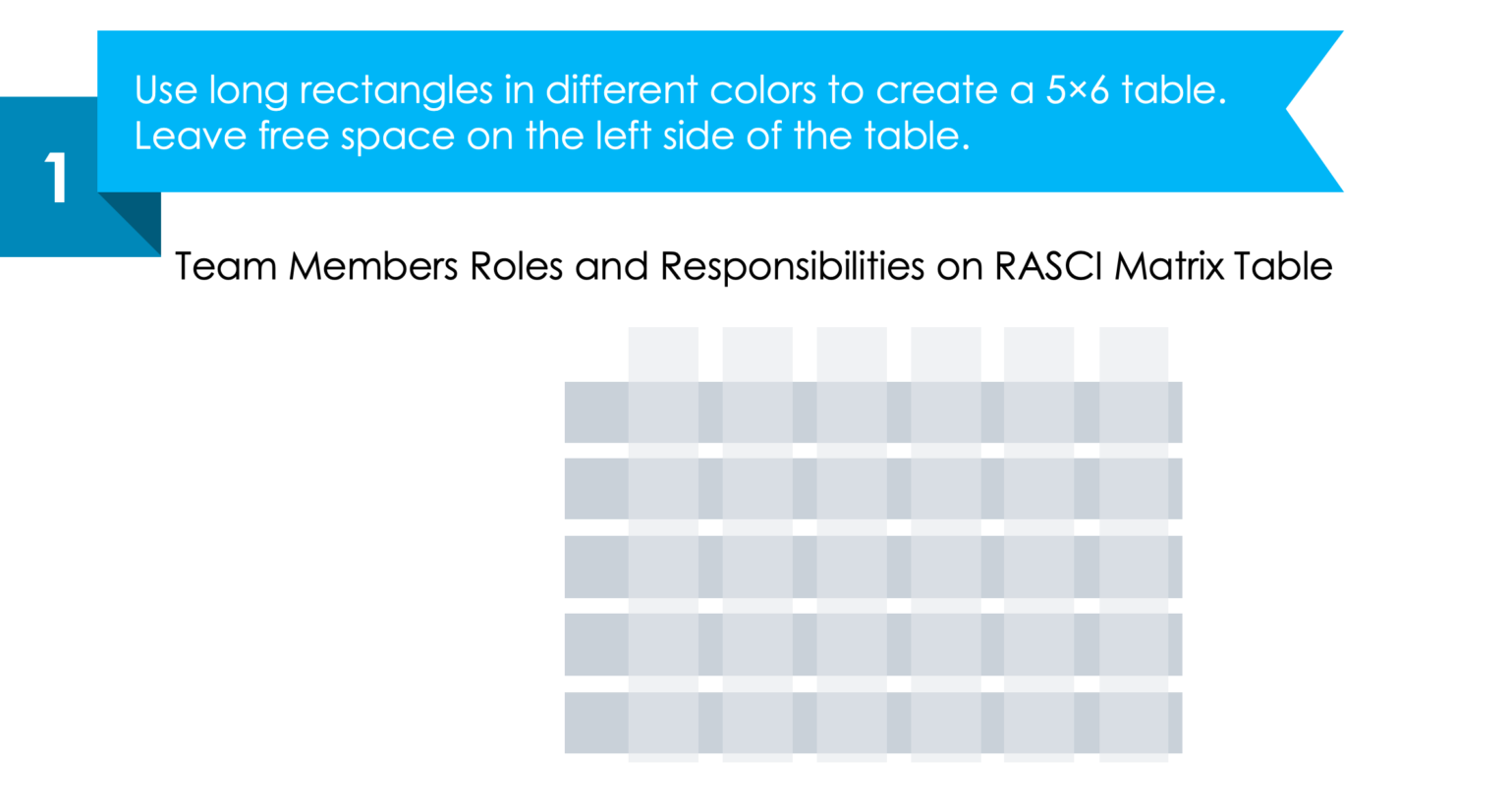
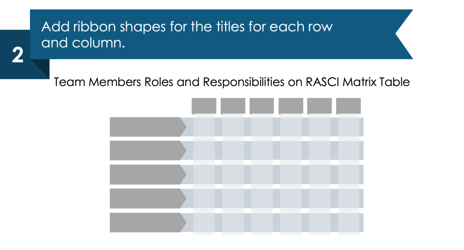
Step 1. Create a table grid by using long rectangles
For starters, create a 5×6 table-like structure with long rectangles in the semitransparent color filling. This will create a nice grid. Ensure it’s evenly distributed (use PowerPoint distribute function in the top menu Shape Format / Align / Distribute Vertically and Horizontally). Also, make sure you have left enough free space on the left-hand side of the table for the RASCI category header.
Step 2. Decorate the titles with ribbons
Create custom-shaped table titles with ribbons decoration for a better-looking grid look. In our case, we added in each row ribbons in an arrow shape pointing to the statuses.
We also designed the new column headers adding a separate rectangle on the column top, where we will put the names of the team roles.
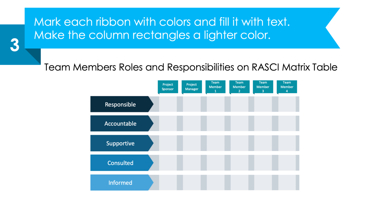
Step 3. Implement some color coding
Look how we added gradient navy blue color for each of the RASCI roles, and dark turquoise for each of the team roles. Such a design style is not too vivid by purpose, as we want to focus attention on the checklist values, not categories.
Furthermore, the shapes we included previously, have enough space for adding text.
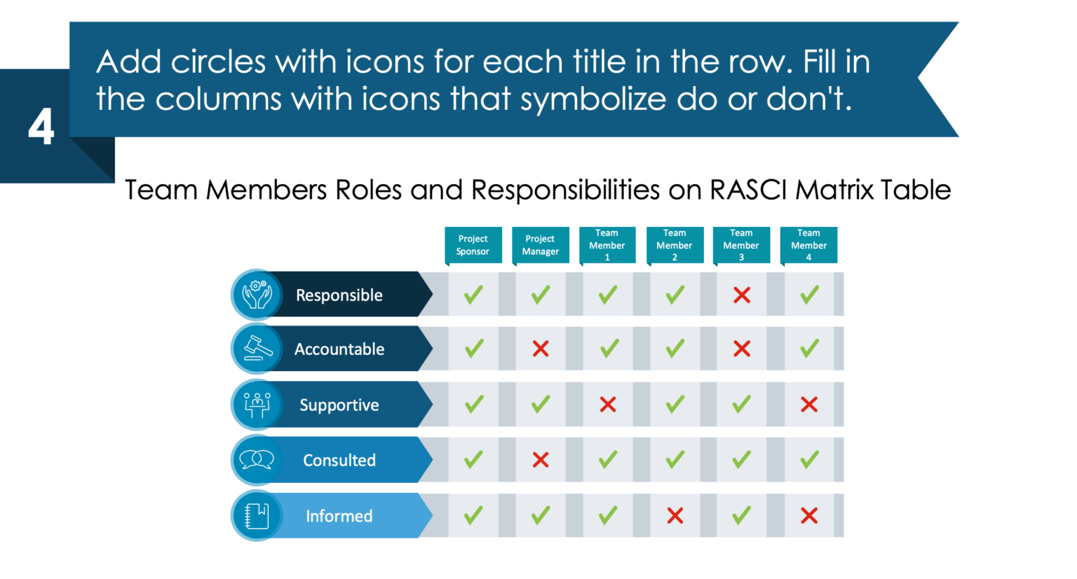
Step 4. Fill the checklist, add icons for greater impact
As a final touch, we have added circles with icons and filled the columns with checkmarks and cross marks for a status – do or don’t.
Notice the use of color coding for easier status recognition. Yes checkmark is green (dark enough to be readable) and No symbol is red.
I hope you liked this simple guide and that it gave you some visual ideas for your next presentation.
Remember, a good effective presentation that is easy to read will persuade your audience to stay engaged and will send a straightforward message.
Here’s a YouTube guide as well:
Still not sure how to design PowerPoint slides by yourself? Make sure to download this free sample kit with different slides and icons for mastering in no time!
Source
The slide makeover used here is part of the infoDiagram’s To-Do Presentation Checklist Graphics Template. Check there for more slides.
In addition, you can read this blog for To-Do Checklist Illustrations for more inspiration.
Recent Posts

The Importance of a Spell Checking in PowerPoint Presentations
As a designer, I can write long posts about the importance of good design on slides 🙂 However, one aspect that is often overlooked but equally important is the accuracy of text on a slide. Typos and spelling errors can undermine your credibility, distract your audience, and diminish the overall effectiveness of your presentation. Let […]

Introduction to Align & Distribute PowerPoint Tools
In the realm of PowerPoint presentations, the visual aspect plays a crucial role in conveying information effectively. Proper alignment can bring order, consistency, and polish to your presentation. In this post, I’ll explore the importance of alignment in PowerPoint and introduce you to the Align & Distribute tools that can take your slide design to […]

The Most Common Mistakes in a Presentation to Avoid
Have you ever wondered what the most common mistakes are when preparing a PowerPoint presentation? Do you think you might be making these mistakes? Let’s find out. I have prepared a list of the most common mistakes made on slides for you:

Slide Redesign: Presenting Business Values with a Radar Chart
Let’s talk a little about charts in PowerPoint 🙂 Have you ever used a specific chart type called radar? I bet your answer is NO or RARELY and I’m not surprised. The most common charts used in PowerPoint presentations are bar charts and pie charts but I’d like to show you how to replace typical […]

Slide Redesign: Presenting the OKR Setting Process with a Timeline Flowchart
Today I’d like to show you how creatively you can replace a typical and not attractive table with a timeline flowchart. I chose the example of the OKR setting process which contains 3 steps and has quite a lot of text, so it’s a more difficult task because there is not much area to use […]

Slide Redesign: Presenting the Meeting Agenda with a Creative Timeline
I’d like to show you how you can creatively present your meeting agenda in PowerPoint. Creating a list of consecutive meeting sections is not enough to grasp your audience’s attention. If you present the agenda the boring way, it’s gonna be a signal to your participants that the meeting might be boring too. Content is […]

Slide Redesign: Presenting the List of NPS Benefits with a Creative Infographic
I’d like to show you an alternative way of presenting a list of the benefits in PowerPoint. Actually, a list doesn’t mean that text must be arranged in bullet points or numbers. This way of presenting content is so ordinary and common that slides with typical lists do not impress the audience. I will explain […]

What Fonts To Use In PowerPoint Presentation
What fonts are good to use, to make your slide look professional? Let us suggest you several font proposals and where to get them from.

7 Design Tips for Professional PowerPoint Slide
Here are some design best-practice rules to help you create a professional visual slides in PowerPoint:

Slide Redesign: Presenting the Process of Employer Branding with the Roadmap
Today I’d like to show you a redesign of a PowerPoint slide with a multistep process with subcategories. Probably the first version will be in a form of numbered text list presenting each step. Yes, you can create it that way, but we’d like to make our slide look more attractive visually. I will work […]

Slide Redesign: Project Launch Stages Illustrated with Activities Icons
Do you present the launch stages of your project? The easiest way to present stages is to use a number or bullet list. But it’s a common and boring solution. Let’s try to avoid using a typical PowerPoint list and instead of it let’s make a creative slide. In today’s case study, we’re going to […]

Slide Redesign: Presenting Team or Contact Persons
Do you need to present in your pitch deck the key persons to contact? The easiest way to show your team on the slide is to put the data into the table. But we don’t want to use a typical table that we know from Excel. Let’s create an interesting infographic in PowerPoint on the […]

Slide Design: BCG Comparison Matrix in PowerPoint
Do you need to compare several options over two criteria? Try to use a matrix visual form. To create such a matrix comparison in your presentation you don’t need any special software for that. You can do it very easily in PowerPoint. And such a matrice can look very attractive. I’m going to illustrate it […]

Slide Redesign: Checklist in PowerPoint on Due Diligence Example
Do you need to present a checklist of some kind? In today’s blog, we will give you some directions on how to redesign a checklist type of slide content, on the example of legal due diligence. But first, let’s see why we have optioned a checklist, rather than a standard bullet point text.

Slide Redesign: Use Road Signs Graphics for Rule Incorporation
Do you need to express rules, regulations or dos and don’ts on a slide? Consider illustrating your points with a visual metaphor everybody recognizes – traffic signs. Adding such graphics will help you to pass a clear message while having the audience’s full attention thanks to the symbols. Let’s see how we can redesign a […]