
Need to present a start-up idea to your investors? Having a strong portfolio and team presentation it’s crucial to receiving the needed funds for starting the business. Also, it’s important to use the limited time for presenting wisely. That can be achieved with well-prepared slides beforehand. In this post, we have prepared for you an inspiration on how to present a part of the pitch deck – the team slide.
All you need for this reconstruction is four simple steps.
The Team Slide Before the Redesign

The slide presented here lacks creativity and personal touch. It wouldn’t leave any impression on your investors. It uses a boring simple default table and therefore it appears as if it was made in rush.
You can do much better if you use some creative shapes, add persons’ pictures and consistent design elements.
The Team Slide After the Redesign
Here’s how we would re-create this slide, using line graphics. Such style creates a feeling of modern elegance without overwhelming the content.

When we compare them together, there’s no doubt that the redesigned slide looks far more professional, and interesting to look into.

Let’s see now step by step how to turn this slide into an impactful presentation with presentable elements and graphics.
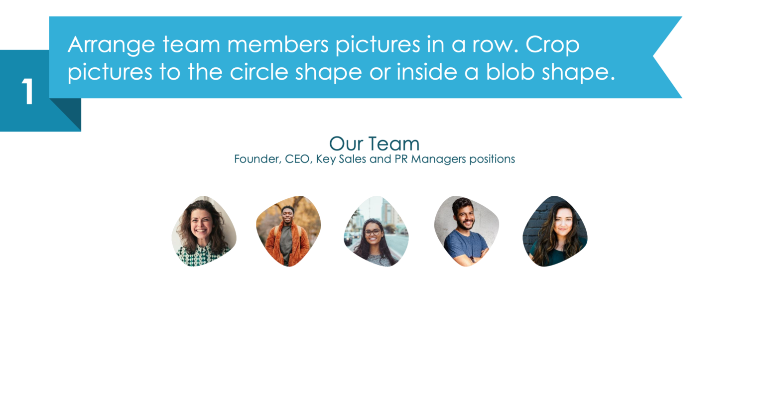
Step 1. Add pictures of the team members
Replacing the human icons with real-life pictures will give a much more personalized touch and will appear more presentable. It’s always good to put a face to the name since it shows also that you acknowledge each member’s contribution to your work. To make your slide look much less average, place every picture into a blob shape just as we did. As a result, you will have much more space and a clean-looking presentation.
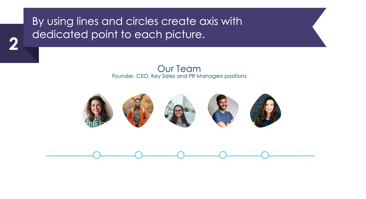
Step 2. Create a structure with lines and circles
As a next step, add a straight line vector and dots in a form of circles. You will use this line in the following steps to add a description under each picture.
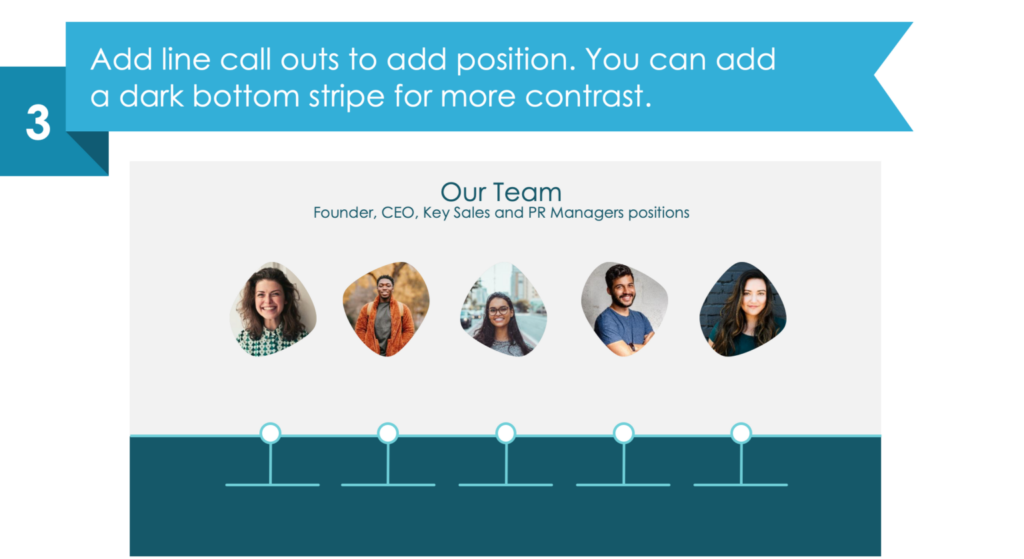
Step 3. Enrich your slide with more graphic elements
You can add line call-outs for explaining everyone’s position. Also, you can apply a dark bottom stripe which will contrast well with the added text.
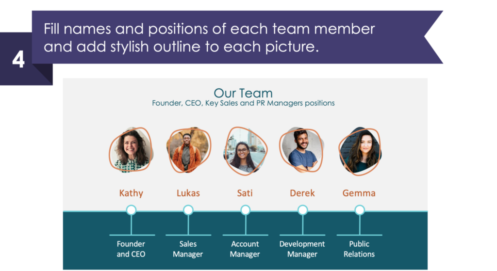
Step 4. Write the names and positions of the team
And finally, write down your team members’ names and positions. As a bonus, add some stylish organic shape outline to each picture to make your slide even more unique. In our case, we have added orange irregular circles which go great with the color of the names.
I hope you had fun reading this, and it encouraged you to make your presentation more creative. If you still aren’t sure what a good slide should look like, make sure you read our post covering this topic.
We have also a free sample kit for you, so you can practice your designing skills.
There’s also a video illustration that you might like:
Source
The slide makeover used in this blog is an inspiration from the infoDiagram’s Creative Investor Pitch Deck Template. You can find there more ideas on building the whole portfolio.
Additionally, in this blog, you can find some useful tips on how to prepare the rest of the pitch presentation.
Recent Posts

The Importance of a Spell Checking in PowerPoint Presentations
As a designer, I can write long posts about the importance of good design on slides 🙂 However, one aspect that is often overlooked but equally important is the accuracy of text on a slide. Typos and spelling errors can undermine your credibility, distract your audience, and diminish the overall effectiveness of your presentation. Let […]

Introduction to Align & Distribute PowerPoint Tools
In the realm of PowerPoint presentations, the visual aspect plays a crucial role in conveying information effectively. Proper alignment can bring order, consistency, and polish to your presentation. In this post, I’ll explore the importance of alignment in PowerPoint and introduce you to the Align & Distribute tools that can take your slide design to […]

The Most Common Mistakes in a Presentation to Avoid
Have you ever wondered what the most common mistakes are when preparing a PowerPoint presentation? Do you think you might be making these mistakes? Let’s find out. I have prepared a list of the most common mistakes made on slides for you:

Slide Redesign: Presenting Business Values with a Radar Chart
Let’s talk a little about charts in PowerPoint 🙂 Have you ever used a specific chart type called radar? I bet your answer is NO or RARELY and I’m not surprised. The most common charts used in PowerPoint presentations are bar charts and pie charts but I’d like to show you how to replace typical […]

Slide Redesign: Presenting the OKR Setting Process with a Timeline Flowchart
Today I’d like to show you how creatively you can replace a typical and not attractive table with a timeline flowchart. I chose the example of the OKR setting process which contains 3 steps and has quite a lot of text, so it’s a more difficult task because there is not much area to use […]

Slide Redesign: Presenting the Meeting Agenda with a Creative Timeline
I’d like to show you how you can creatively present your meeting agenda in PowerPoint. Creating a list of consecutive meeting sections is not enough to grasp your audience’s attention. If you present the agenda the boring way, it’s gonna be a signal to your participants that the meeting might be boring too. Content is […]

Slide Redesign: Presenting the List of NPS Benefits with a Creative Infographic
I’d like to show you an alternative way of presenting a list of the benefits in PowerPoint. Actually, a list doesn’t mean that text must be arranged in bullet points or numbers. This way of presenting content is so ordinary and common that slides with typical lists do not impress the audience. I will explain […]

What Fonts To Use In PowerPoint Presentation
What fonts are good to use, to make your slide look professional? Let us suggest you several font proposals and where to get them from.

7 Design Tips for Professional PowerPoint Slide
Here are some design best-practice rules to help you create a professional visual slides in PowerPoint:

Slide Redesign: Presenting the Process of Employer Branding with the Roadmap
Today I’d like to show you a redesign of a PowerPoint slide with a multistep process with subcategories. Probably the first version will be in a form of numbered text list presenting each step. Yes, you can create it that way, but we’d like to make our slide look more attractive visually. I will work […]

Slide Redesign: Project Launch Stages Illustrated with Activities Icons
Do you present the launch stages of your project? The easiest way to present stages is to use a number or bullet list. But it’s a common and boring solution. Let’s try to avoid using a typical PowerPoint list and instead of it let’s make a creative slide. In today’s case study, we’re going to […]

Slide Redesign: Presenting Team or Contact Persons
Do you need to present in your pitch deck the key persons to contact? The easiest way to show your team on the slide is to put the data into the table. But we don’t want to use a typical table that we know from Excel. Let’s create an interesting infographic in PowerPoint on the […]

Slide Design: BCG Comparison Matrix in PowerPoint
Do you need to compare several options over two criteria? Try to use a matrix visual form. To create such a matrix comparison in your presentation you don’t need any special software for that. You can do it very easily in PowerPoint. And such a matrice can look very attractive. I’m going to illustrate it […]

Slide Redesign: Checklist in PowerPoint on Due Diligence Example
Do you need to present a checklist of some kind? In today’s blog, we will give you some directions on how to redesign a checklist type of slide content, on the example of legal due diligence. But first, let’s see why we have optioned a checklist, rather than a standard bullet point text.

Slide Redesign: Use Road Signs Graphics for Rule Incorporation
Do you need to express rules, regulations or dos and don’ts on a slide? Consider illustrating your points with a visual metaphor everybody recognizes – traffic signs. Adding such graphics will help you to pass a clear message while having the audience’s full attention thanks to the symbols. Let’s see how we can redesign a […]