
The net promoter score is an excellent metric to measure customer satisfaction and usually ranges from 0-10. Implementing this metric into your business will bring benefits, such as customer retention, future referrals, etc.
We have prepared for you an infographic slide, covering the net promoter score benefits, so you can present this idea to your team, and see whether you have achieved customer loyalty and satisfaction.
Keep reading to see how we turned a standard-looking slide into an engaging visual presentation.
The Net Promoter Score Slide Before the Redesign

Our source slide presented above looks boring and stuffed with information. The simple bullet points, the lack of color, and the elements are making the slide look very plain.
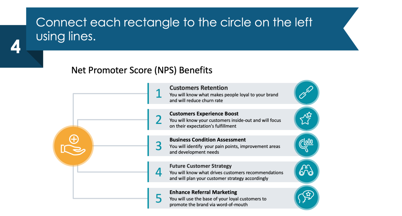
Below is what the improved version looks like.
The Net Promoter Score Slide After the Redesign
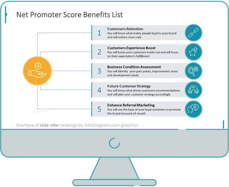
When compared, we can see that the uplifted slide looks more organized, element-rich, and clean.

Let’s discuss now the redesign process step by step.
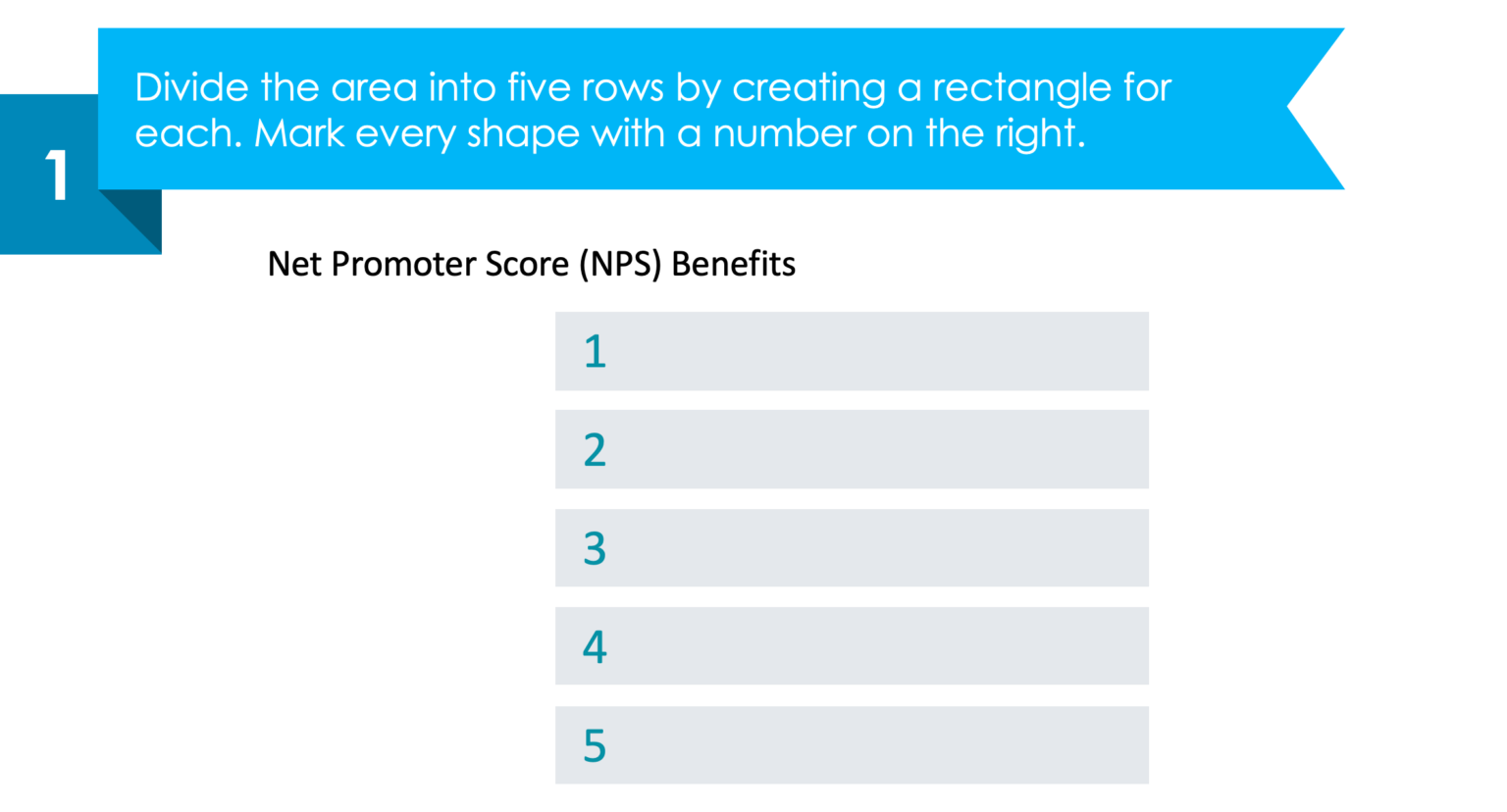
Step 1. Divide the area into five rows and add enumeration
Firstly, add five rows by creating a rectangle for each area. Then, add enumeration to each of them.
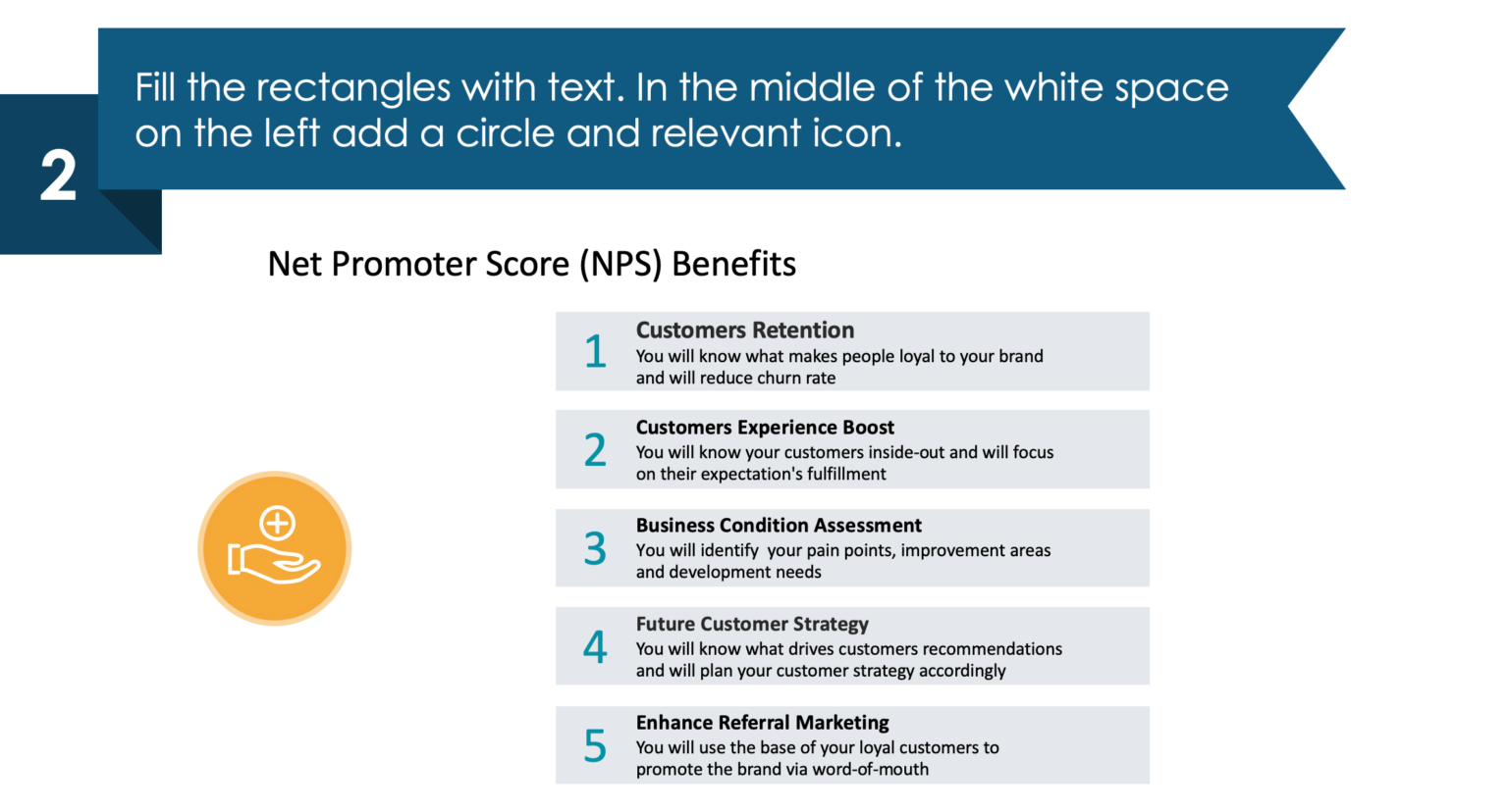
Step 2. Add text and an icon in the free space
As a next step, write every one of the net promoter score benefits in the rectangles we added previously. On the left-hand side of the slide, add a circle with an icon in the middle of the free space.
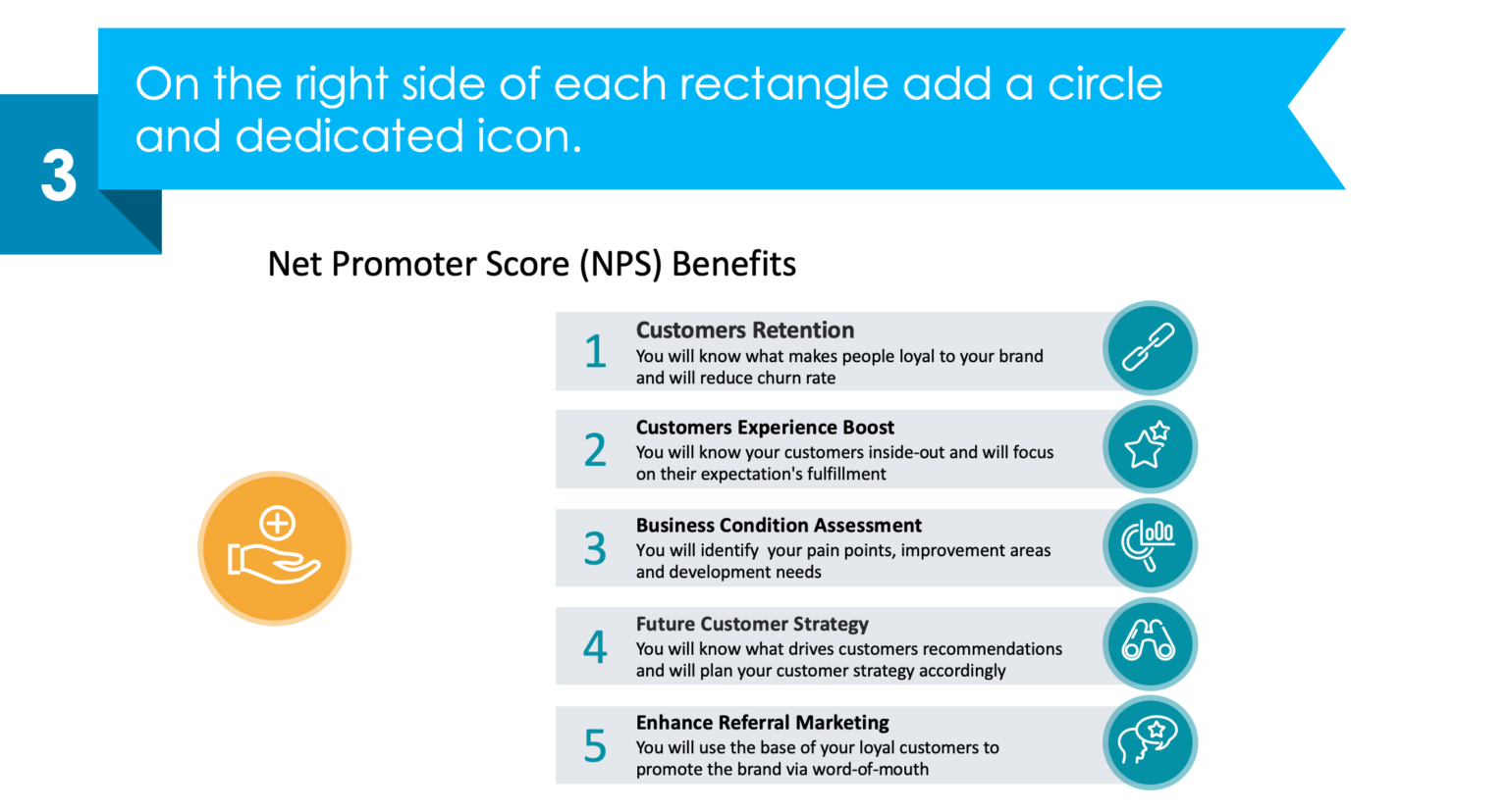
Step 3. Add a representative icon to each of the sections
Enrich your slide by simply adding circles next to each section, and fill them with associative icons just like on the picture below – chain icon for customer retention, stars icon for customer experience, boost/feedback, etc. It will give a better perspective to your audience for the discussion point.
Step 4. Connect the rectangles with the main icon
As a wrap-up, add line vectors starting from each segment, ending with the main icon on the left-hand side, that we placed previously. Basically, all the segments have the same starting point – adding value to something or someone!
Keep in mind that a well-organized slide should always contain visuals, icons, and graphic elements. It will show also that you have put effort into your work, and that you can successfully send a clear message to your team.
Here is a YouTube guide that you might find useful as well.
We also have in the store for you a free sample with colorful diagrams and icons, so you can start creating good-looking slides by yourself!
Sources
The slide makeover we used in this blog is part of the infoDiagram’s NPS Analysis Dashboard for Customer Loyalty Metrics collection. You can find there more slide ideas.
Check out this blog for more illustration tips.
Recent Posts

The Importance of a Spell Checking in PowerPoint Presentations
As a designer, I can write long posts about the importance of good design on slides 🙂 However, one aspect that is often overlooked but equally important is the accuracy of text on a slide. Typos and spelling errors can undermine your credibility, distract your audience, and diminish the overall effectiveness of your presentation. Let […]

Introduction to Align & Distribute PowerPoint Tools
In the realm of PowerPoint presentations, the visual aspect plays a crucial role in conveying information effectively. Proper alignment can bring order, consistency, and polish to your presentation. In this post, I’ll explore the importance of alignment in PowerPoint and introduce you to the Align & Distribute tools that can take your slide design to […]

The Most Common Mistakes in a Presentation to Avoid
Have you ever wondered what the most common mistakes are when preparing a PowerPoint presentation? Do you think you might be making these mistakes? Let’s find out. I have prepared a list of the most common mistakes made on slides for you:

Slide Redesign: Presenting Business Values with a Radar Chart
Let’s talk a little about charts in PowerPoint 🙂 Have you ever used a specific chart type called radar? I bet your answer is NO or RARELY and I’m not surprised. The most common charts used in PowerPoint presentations are bar charts and pie charts but I’d like to show you how to replace typical […]

Slide Redesign: Presenting the OKR Setting Process with a Timeline Flowchart
Today I’d like to show you how creatively you can replace a typical and not attractive table with a timeline flowchart. I chose the example of the OKR setting process which contains 3 steps and has quite a lot of text, so it’s a more difficult task because there is not much area to use […]

Slide Redesign: Presenting the Meeting Agenda with a Creative Timeline
I’d like to show you how you can creatively present your meeting agenda in PowerPoint. Creating a list of consecutive meeting sections is not enough to grasp your audience’s attention. If you present the agenda the boring way, it’s gonna be a signal to your participants that the meeting might be boring too. Content is […]

Slide Redesign: Presenting the List of NPS Benefits with a Creative Infographic
I’d like to show you an alternative way of presenting a list of the benefits in PowerPoint. Actually, a list doesn’t mean that text must be arranged in bullet points or numbers. This way of presenting content is so ordinary and common that slides with typical lists do not impress the audience. I will explain […]

What Fonts To Use In PowerPoint Presentation
What fonts are good to use, to make your slide look professional? Let us suggest you several font proposals and where to get them from.

7 Design Tips for Professional PowerPoint Slide
Here are some design best-practice rules to help you create a professional visual slides in PowerPoint:

Slide Redesign: Presenting the Process of Employer Branding with the Roadmap
Today I’d like to show you a redesign of a PowerPoint slide with a multistep process with subcategories. Probably the first version will be in a form of numbered text list presenting each step. Yes, you can create it that way, but we’d like to make our slide look more attractive visually. I will work […]

Slide Redesign: Project Launch Stages Illustrated with Activities Icons
Do you present the launch stages of your project? The easiest way to present stages is to use a number or bullet list. But it’s a common and boring solution. Let’s try to avoid using a typical PowerPoint list and instead of it let’s make a creative slide. In today’s case study, we’re going to […]

Slide Redesign: Presenting Team or Contact Persons
Do you need to present in your pitch deck the key persons to contact? The easiest way to show your team on the slide is to put the data into the table. But we don’t want to use a typical table that we know from Excel. Let’s create an interesting infographic in PowerPoint on the […]

Slide Design: BCG Comparison Matrix in PowerPoint
Do you need to compare several options over two criteria? Try to use a matrix visual form. To create such a matrix comparison in your presentation you don’t need any special software for that. You can do it very easily in PowerPoint. And such a matrice can look very attractive. I’m going to illustrate it […]

Slide Redesign: Checklist in PowerPoint on Due Diligence Example
Do you need to present a checklist of some kind? In today’s blog, we will give you some directions on how to redesign a checklist type of slide content, on the example of legal due diligence. But first, let’s see why we have optioned a checklist, rather than a standard bullet point text.

Slide Redesign: Use Road Signs Graphics for Rule Incorporation
Do you need to express rules, regulations or dos and don’ts on a slide? Consider illustrating your points with a visual metaphor everybody recognizes – traffic signs. Adding such graphics will help you to pass a clear message while having the audience’s full attention thanks to the symbols. Let’s see how we can redesign a […]