
Presenting Investor Portfolio’s Risk Levels with a Pyramid Infographic
Do you need to present levels of financial risks? To create a memorable presentation, it’s good to use popular visual metaphors. In the case of risk levels, a pyramid can be a good candidate for a slide illustration. For that reason, we have prepared for you an example of a financial risk pyramid, presenting the issues in a hierarchical matter, from top to bottom.
Keep reading to see how we created this slide.
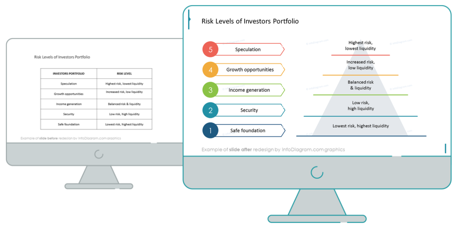
Financial Risks Slide Before the Redesign
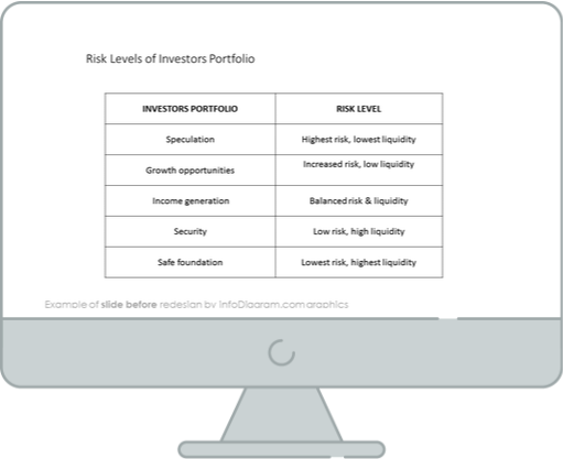
Our source slide presented above shows us a simple white table with a description. It doesn’t emphasize the importance of the risks or prioritization and frankly, it looks pretty boring to look at. In other words, it shows that you are unprepared, and that’s something you would like to avoid.
Now, let’s see how the financial risks can be presented with help of a visual metaphor – a pyramid.
Financial Risks Slide After the Redesign
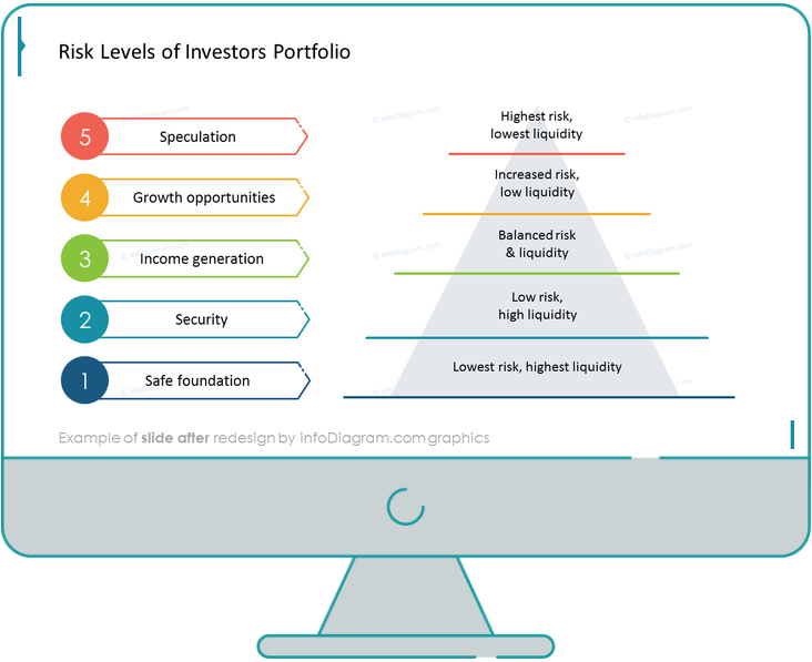
When we compare them together, we can see that the uplifted slide looks far more organized and appealing.
Now, let’s see what are the needed steps to recreate this slide.
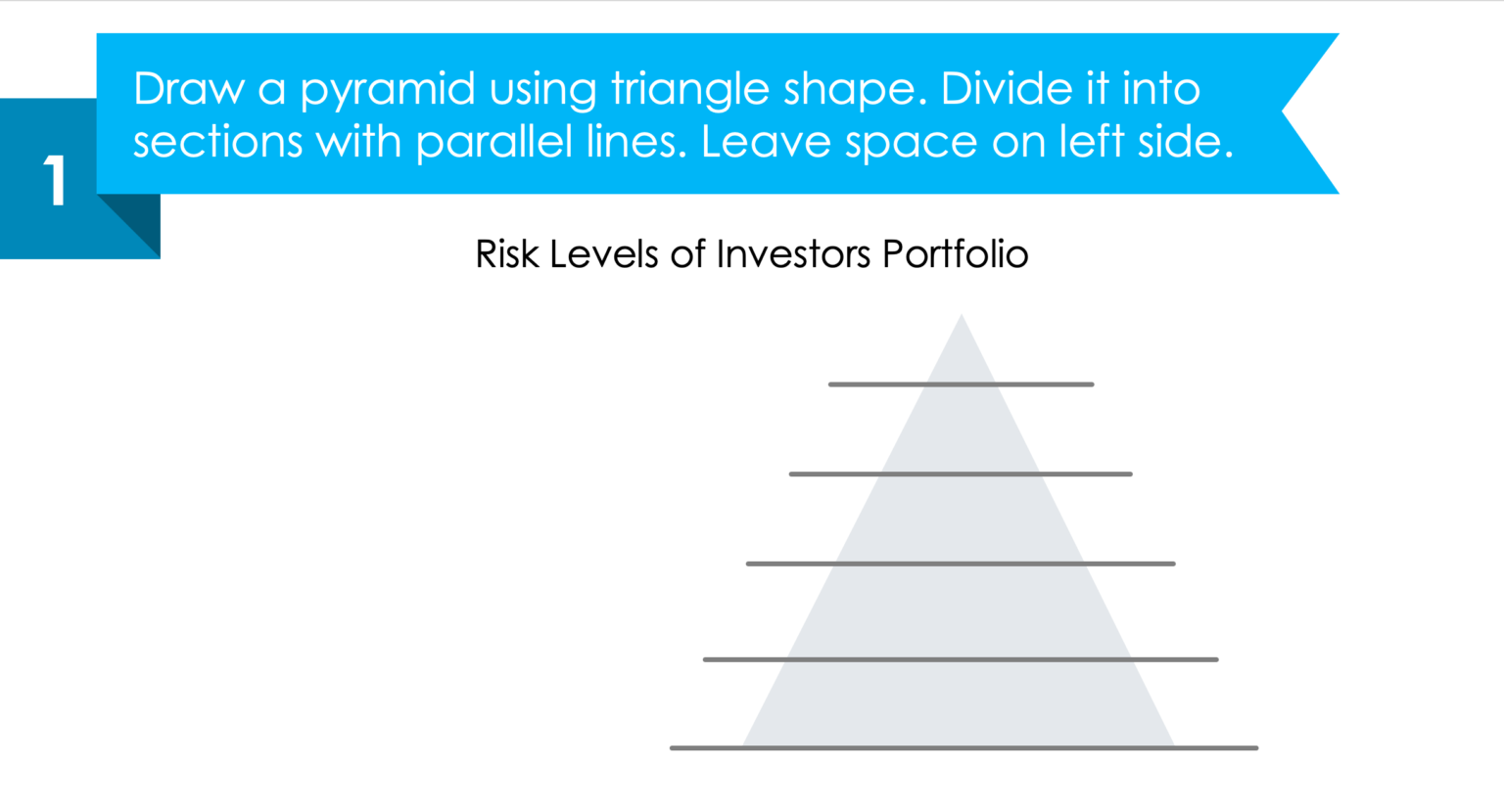
Step 1. Create a simple pyramid shape
Start drawing the pyramid by using a triangle shape. Then, add parallel lines, which will split the vector into several sections. Make sure there is the same distance between the lines and you have enough space on the left-hand side, which we will use later on.
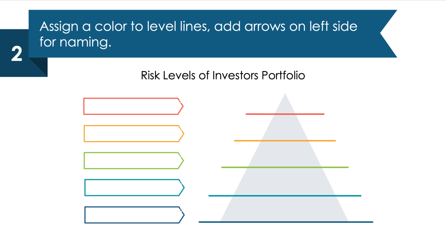
Step 2. Add level headers and color
As a next step, add color to those parallel lines, and in the space we left earlier on, add arrow vectors in the same color as the line which follows on the right-hand side.
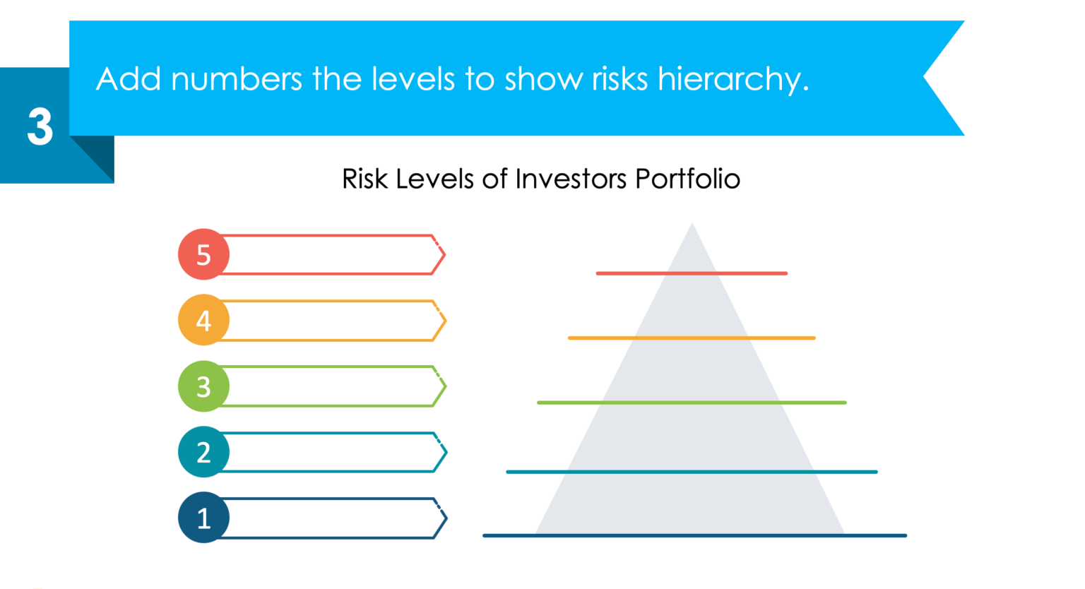
Step 3. Use enumeration to present the hierarchy
Add numbers to each of the levels of the pyramid to present the way to read the risk hierarchy.
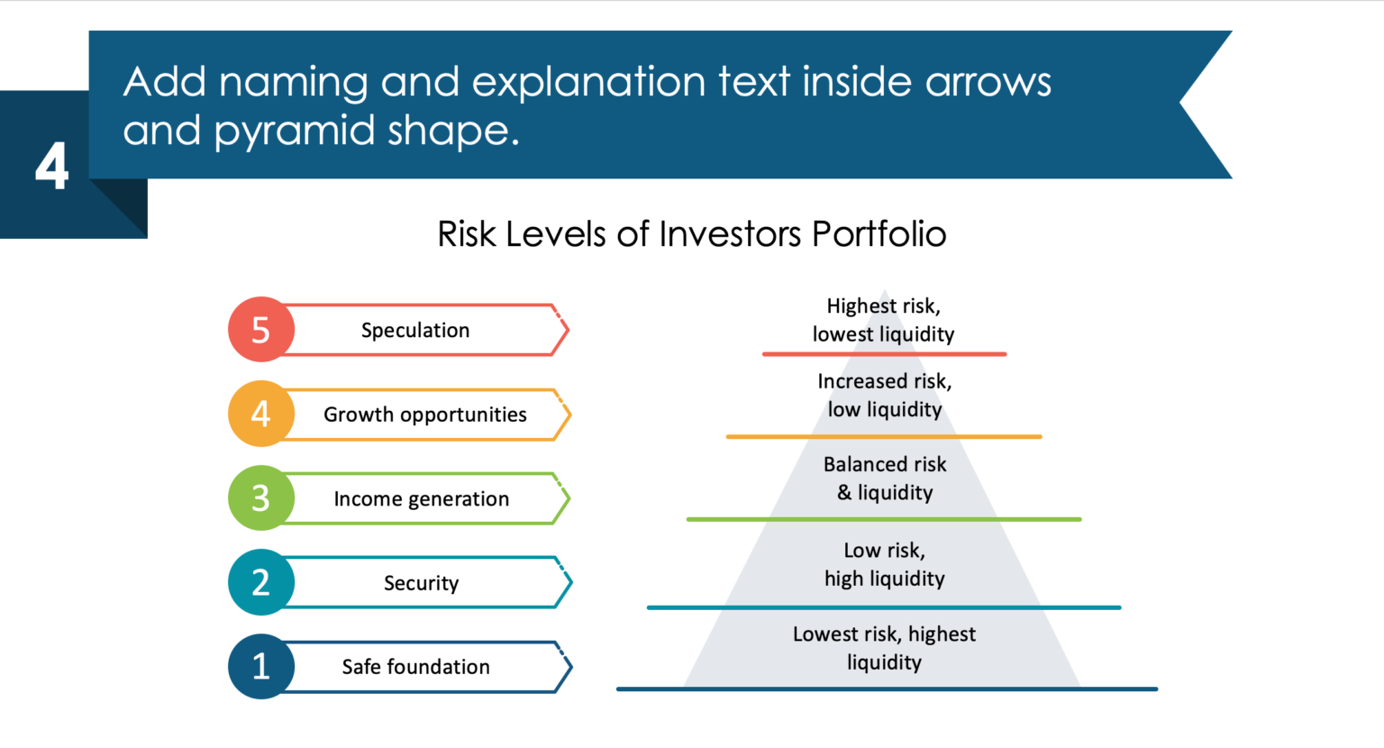
Step 4. Fill pyramid with content
As a finisher, write down the descriptions – assuming that the top level is risk speculation, add the explanation inside the pyramid on the top level, up to the safe foundation and lowest risk that you expect the company to encounter.
I hope you had fun reading this, and that we gave you some interesting tips to use in your presentation.
Here is a YouTube tutorial on how to create different pyramid-style infographics:
Still not sure where to start? In that case, go ahead and download this free sample kit and practice your skills to create the best slide!
Source
The slide makeover we used here is an inspiration from the infoDiagram’s Investment Risk Pyramid Presentation library. Check there for more slides.
You may also like this blog on How to illustrate Risk Levels in PowerPoint.
Recent Posts

The Importance of a Spell Checking in PowerPoint Presentations
As a designer, I can write long posts about the importance of good design on slides 🙂 However, one aspect that is often overlooked but equally important is the accuracy of text on a slide. Typos and spelling errors can undermine your credibility, distract your audience, and diminish the overall effectiveness of your presentation. Let […]

Introduction to Align & Distribute PowerPoint Tools
In the realm of PowerPoint presentations, the visual aspect plays a crucial role in conveying information effectively. Proper alignment can bring order, consistency, and polish to your presentation. In this post, I’ll explore the importance of alignment in PowerPoint and introduce you to the Align & Distribute tools that can take your slide design to […]

The Most Common Mistakes in a Presentation to Avoid
Have you ever wondered what the most common mistakes are when preparing a PowerPoint presentation? Do you think you might be making these mistakes? Let’s find out. I have prepared a list of the most common mistakes made on slides for you:

Slide Redesign: Presenting Business Values with a Radar Chart
Let’s talk a little about charts in PowerPoint 🙂 Have you ever used a specific chart type called radar? I bet your answer is NO or RARELY and I’m not surprised. The most common charts used in PowerPoint presentations are bar charts and pie charts but I’d like to show you how to replace typical […]

Slide Redesign: Presenting the OKR Setting Process with a Timeline Flowchart
Today I’d like to show you how creatively you can replace a typical and not attractive table with a timeline flowchart. I chose the example of the OKR setting process which contains 3 steps and has quite a lot of text, so it’s a more difficult task because there is not much area to use […]

Slide Redesign: Presenting the Meeting Agenda with a Creative Timeline
I’d like to show you how you can creatively present your meeting agenda in PowerPoint. Creating a list of consecutive meeting sections is not enough to grasp your audience’s attention. If you present the agenda the boring way, it’s gonna be a signal to your participants that the meeting might be boring too. Content is […]

Slide Redesign: Presenting the List of NPS Benefits with a Creative Infographic
I’d like to show you an alternative way of presenting a list of the benefits in PowerPoint. Actually, a list doesn’t mean that text must be arranged in bullet points or numbers. This way of presenting content is so ordinary and common that slides with typical lists do not impress the audience. I will explain […]

What Fonts To Use In PowerPoint Presentation
What fonts are good to use, to make your slide look professional? Let us suggest you several font proposals and where to get them from.

7 Design Tips for Professional PowerPoint Slide
Here are some design best-practice rules to help you create a professional visual slides in PowerPoint:

Slide Redesign: Presenting the Process of Employer Branding with the Roadmap
Today I’d like to show you a redesign of a PowerPoint slide with a multistep process with subcategories. Probably the first version will be in a form of numbered text list presenting each step. Yes, you can create it that way, but we’d like to make our slide look more attractive visually. I will work […]

Slide Redesign: Project Launch Stages Illustrated with Activities Icons
Do you present the launch stages of your project? The easiest way to present stages is to use a number or bullet list. But it’s a common and boring solution. Let’s try to avoid using a typical PowerPoint list and instead of it let’s make a creative slide. In today’s case study, we’re going to […]

Slide Redesign: Presenting Team or Contact Persons
Do you need to present in your pitch deck the key persons to contact? The easiest way to show your team on the slide is to put the data into the table. But we don’t want to use a typical table that we know from Excel. Let’s create an interesting infographic in PowerPoint on the […]

Slide Design: BCG Comparison Matrix in PowerPoint
Do you need to compare several options over two criteria? Try to use a matrix visual form. To create such a matrix comparison in your presentation you don’t need any special software for that. You can do it very easily in PowerPoint. And such a matrice can look very attractive. I’m going to illustrate it […]

Slide Redesign: Checklist in PowerPoint on Due Diligence Example
Do you need to present a checklist of some kind? In today’s blog, we will give you some directions on how to redesign a checklist type of slide content, on the example of legal due diligence. But first, let’s see why we have optioned a checklist, rather than a standard bullet point text.

Slide Redesign: Use Road Signs Graphics for Rule Incorporation
Do you need to express rules, regulations or dos and don’ts on a slide? Consider illustrating your points with a visual metaphor everybody recognizes – traffic signs. Adding such graphics will help you to pass a clear message while having the audience’s full attention thanks to the symbols. Let’s see how we can redesign a […]