
Did you have a very successful business year and want to share this annual report with management? We have prepared for you the perfect goals achievement summary slide, with interesting infographics for an impactful presentation.
We always aim to make the best presentations for you, and hopefully this time won’t be any different. Once again, it requires only four simple steps.
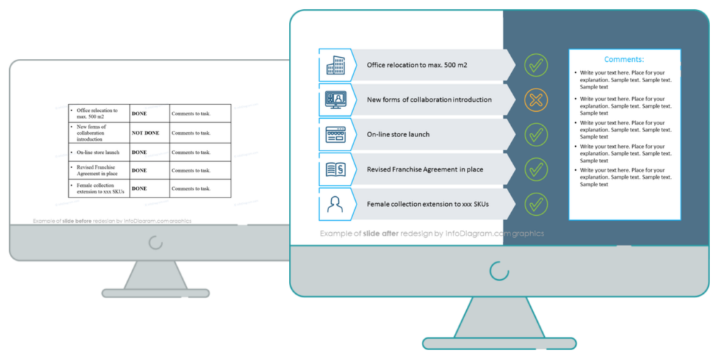
The Annual Report Slide Before the Redesign
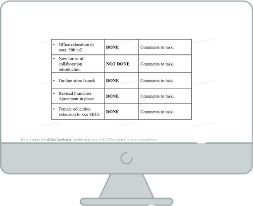
Our source slide presented here looks very plain and unengaging. It’s full of text that is difficult to follow. Definitely does not give the best impression.
The Annual Report Slide After the Redesign
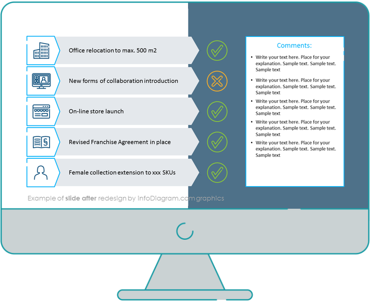
It’s a completely different story after the redesign. Filling out the whole free space in the frame gives us the option to include more shapes, put colors, add icons, and also a dark background to compliment all the elements presented. As a result, we have a wonderful infographic slide that presents a clear, concise message to the audience.
Let’s quickly analyze them together.
Now, let’s see step-by-step how to beautify this slide with graphic elements for better engagement.
Step 1. Skip the Table and put the Text in Shapes Instead

Using a standard table format gets monotonous over time, so it’s best to avoid it. Replacing it with arrow-shaped banners looks much more appealing. Additionally, the grey background contrasts very well with the black text.
Step 2. Remember to Add the Icons for Every Element

We’ve mentioned this many times. Adding icons related to the section you’re discussing creates both better visualization and association with the given problem/situation. Here we’ve put synonym icons and status marks such as a checkmark for Done, and a cross mark for Not Done or incomplete.
Step 3. Use the Free Space to add comments

Use the free space left on the right-hand side to add a rectangular shape for the comment section. Discuss the resources needed to achieve the incomplete steps, the process for the achievements etc. We suggest using OKR Review for incomplete projects.
Step 4. Accessorize Your Final Slide

As a final step, make your slide more appealing by adding a dark theme background and some color coding. We added green for the finished projects and orange for the incomplete ones.
Here’s the YouTube Video Tutorial on How to Create an Annual Report in PowerPoint for more ideas.
I hope this blog inspired you because now you have the option to recreate slides by yourself with this free kit of diagrams and icons!
Source
The graphic slide makeover we used here is part of the Annual Report Company Performance Presentation Template. Check it out for more slide ideas related to this topic.
Check out this How to Present Business Highlights in Your Annual Report related article.
Recent Posts

The Importance of a Spell Checking in PowerPoint Presentations
As a designer, I can write long posts about the importance of good design on slides 🙂 However, one aspect that is often overlooked but equally important is the accuracy of text on a slide. Typos and spelling errors can undermine your credibility, distract your audience, and diminish the overall effectiveness of your presentation. Let […]

Introduction to Align & Distribute PowerPoint Tools
In the realm of PowerPoint presentations, the visual aspect plays a crucial role in conveying information effectively. Proper alignment can bring order, consistency, and polish to your presentation. In this post, I’ll explore the importance of alignment in PowerPoint and introduce you to the Align & Distribute tools that can take your slide design to […]

The Most Common Mistakes in a Presentation to Avoid
Have you ever wondered what the most common mistakes are when preparing a PowerPoint presentation? Do you think you might be making these mistakes? Let’s find out. I have prepared a list of the most common mistakes made on slides for you:

Slide Redesign: Presenting Business Values with a Radar Chart
Let’s talk a little about charts in PowerPoint 🙂 Have you ever used a specific chart type called radar? I bet your answer is NO or RARELY and I’m not surprised. The most common charts used in PowerPoint presentations are bar charts and pie charts but I’d like to show you how to replace typical […]

Slide Redesign: Presenting the OKR Setting Process with a Timeline Flowchart
Today I’d like to show you how creatively you can replace a typical and not attractive table with a timeline flowchart. I chose the example of the OKR setting process which contains 3 steps and has quite a lot of text, so it’s a more difficult task because there is not much area to use […]

Slide Redesign: Presenting the Meeting Agenda with a Creative Timeline
I’d like to show you how you can creatively present your meeting agenda in PowerPoint. Creating a list of consecutive meeting sections is not enough to grasp your audience’s attention. If you present the agenda the boring way, it’s gonna be a signal to your participants that the meeting might be boring too. Content is […]

Slide Redesign: Presenting the List of NPS Benefits with a Creative Infographic
I’d like to show you an alternative way of presenting a list of the benefits in PowerPoint. Actually, a list doesn’t mean that text must be arranged in bullet points or numbers. This way of presenting content is so ordinary and common that slides with typical lists do not impress the audience. I will explain […]

What Fonts To Use In PowerPoint Presentation
What fonts are good to use, to make your slide look professional? Let us suggest you several font proposals and where to get them from.

7 Design Tips for Professional PowerPoint Slide
Here are some design best-practice rules to help you create a professional visual slides in PowerPoint:

Slide Redesign: Presenting the Process of Employer Branding with the Roadmap
Today I’d like to show you a redesign of a PowerPoint slide with a multistep process with subcategories. Probably the first version will be in a form of numbered text list presenting each step. Yes, you can create it that way, but we’d like to make our slide look more attractive visually. I will work […]

Slide Redesign: Project Launch Stages Illustrated with Activities Icons
Do you present the launch stages of your project? The easiest way to present stages is to use a number or bullet list. But it’s a common and boring solution. Let’s try to avoid using a typical PowerPoint list and instead of it let’s make a creative slide. In today’s case study, we’re going to […]

Slide Redesign: Presenting Team or Contact Persons
Do you need to present in your pitch deck the key persons to contact? The easiest way to show your team on the slide is to put the data into the table. But we don’t want to use a typical table that we know from Excel. Let’s create an interesting infographic in PowerPoint on the […]

Slide Design: BCG Comparison Matrix in PowerPoint
Do you need to compare several options over two criteria? Try to use a matrix visual form. To create such a matrix comparison in your presentation you don’t need any special software for that. You can do it very easily in PowerPoint. And such a matrice can look very attractive. I’m going to illustrate it […]

Slide Redesign: Checklist in PowerPoint on Due Diligence Example
Do you need to present a checklist of some kind? In today’s blog, we will give you some directions on how to redesign a checklist type of slide content, on the example of legal due diligence. But first, let’s see why we have optioned a checklist, rather than a standard bullet point text.

Slide Redesign: Use Road Signs Graphics for Rule Incorporation
Do you need to express rules, regulations or dos and don’ts on a slide? Consider illustrating your points with a visual metaphor everybody recognizes – traffic signs. Adding such graphics will help you to pass a clear message while having the audience’s full attention thanks to the symbols. Let’s see how we can redesign a […]