Don’t you have an impression that raw tables in PowerPoint are monotonous and unattractive to read? Tables are very often used in PowerPoint content, so to make your presentation unusual, try something different for a change. I recommend replacing them with a more creative design.
So let me show you how to do it. You will redesign your boring table into a stunning infographic just with a few steps. We’re going to use a slide representing the omnichannel retail strategy.
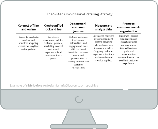
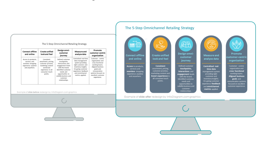
Slide with the omnichannel retail strategy before the redesign
Our source slide contains a raw table full of text. It’s not very smooth to read it and does not look attractive at all, due to the default monotonous table design.
Let’s see what an interesting infographic we can create using simple shapes available in PowerPoint.
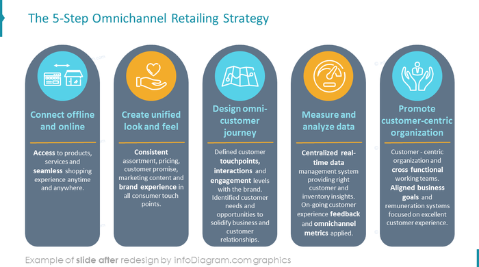
Slide after the redesign is below. Notice what untypical look we can give to the table structure when applying proper color and graphics strategy. Using non-rectangle shapes also adds a creative touch to the slide.
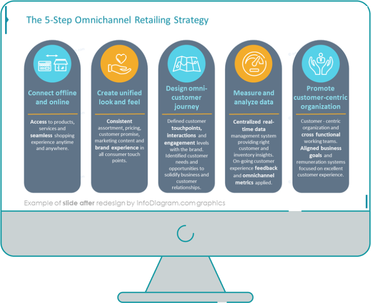
During the process of the slide redesign, I start the work of analyzing the source slide’s structure. It helps to find out the main graphical theme for the new slide. In the case of the slide with omnichannel retail strategy, I decided to separate columns from the default table. By comparing both slides, it’s clear that redesigned slide is much more legible.
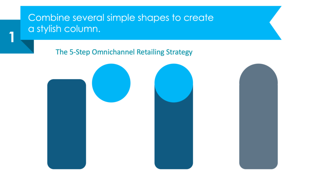
Step 1: Create a sophisticated column design
Let’s start with replacing ordinary table rectangle cell shapes by something more creative. I created a new column type based on shapes.
Combining shapes in PowerPoint is a really simple process. Our stylish column was created by using a “union” function of two simple shapes (a rectangle with rounded corners and a circle).
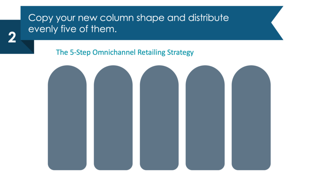
Step 2: Duplicate and distribute the column shape
We need to create five columns (one column for each step). The easiest way to do it is to duplicate (shortcut: Ctrl/cmd + D) the column five times. Then align objects and distribute them evenly.
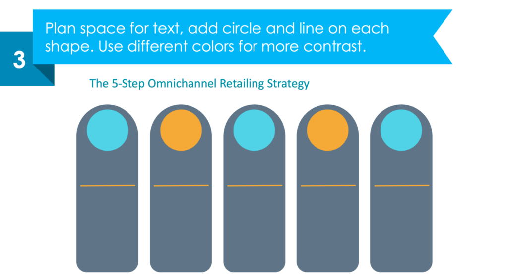
Step 3: Planning the space for the content
Let’s think for a moment about the content, and how it should look like. In case of having long text, it’s a good idea to diversify blocks of text with graphical accents as icons. So consequently we planned the circle backgrounds for placing icons and oranges lines for separating headers and paragraphs.
Step 4: Fill the columns with the content
The last step but not least is to fill the columns with the text and add icons. Remember that a properly chosen icon is more powerful than any words.
Check the slide below what icons we chose to represent each step of the omnichannel retailing strategy.
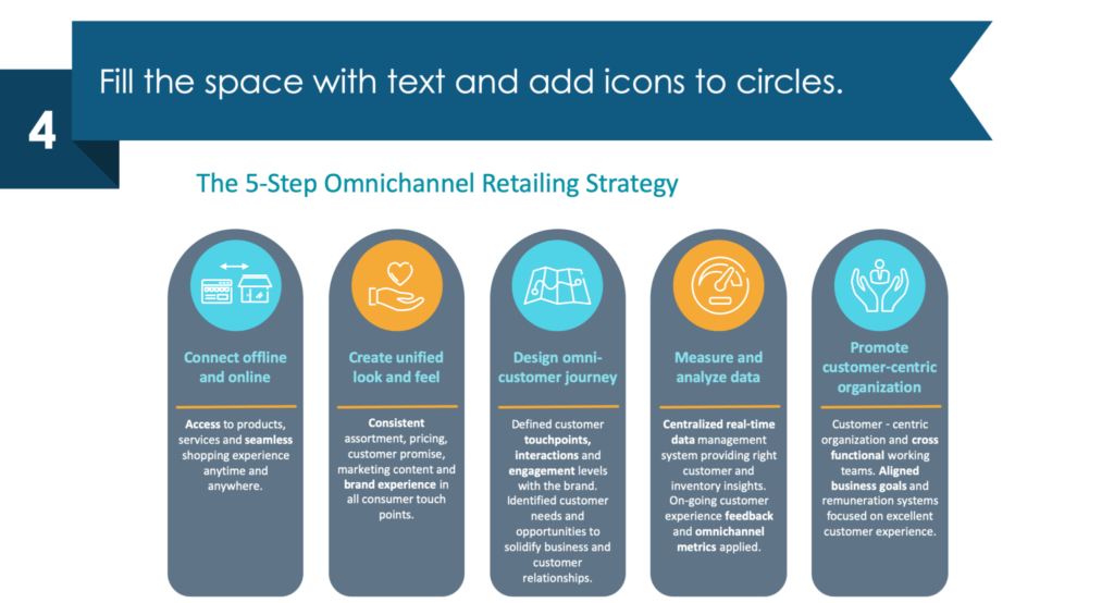
As you can see four steps are enough to refresh the typical PowerPoint table.
For more graphics ideas on the topic of retail presentations, check article 7 Slide Layout Ideas to Illustrate Omnichannel Strategy and Metrics. On other side, if you seek other redesign ideas, read our series of posts How to redesign a specific slide content.
Here is an animated dynamic presentation of the steps above – our YouTube movie illustrating more parts of Omnichannel Strategy in PowerPoint.
Sources
The slide makeover graphics we described here is based on the Omnichannel Retail Strategy Presentation infodiagram collection. Check there more slide graphics on this topic.
Try to redesign by your own
You can get a sample of free PowerPoint diagrams and icons that you can use to play with this kind of presentation graphics.
Related Posts
You may also like other posts.

The Importance of a Spell Checking in PowerPoint Presentations
As a designer, I can write long posts about the importance of good design on slides 🙂 However, one aspect that is often overlooked but equally important is the accuracy of text on a slide. Typos and spelling errors can undermine your credibility, distract your audience, and diminish the overall effectiveness of your presentation. Let […]

Introduction to Align & Distribute PowerPoint Tools
In the realm of PowerPoint presentations, the visual aspect plays a crucial role in conveying information effectively. Proper alignment can bring order, consistency, and polish to your presentation. In this post, I’ll explore the importance of alignment in PowerPoint and introduce you to the Align & Distribute tools that can take your slide design to […]

The Most Common Mistakes in a Presentation to Avoid
Have you ever wondered what the most common mistakes are when preparing a PowerPoint presentation? Do you think you might be making these mistakes? Let’s find out. I have prepared a list of the most common mistakes made on slides for you:

Slide Redesign: Presenting Business Values with a Radar Chart
Let’s talk a little about charts in PowerPoint 🙂 Have you ever used a specific chart type called radar? I bet your answer is NO or RARELY and I’m not surprised. The most common charts used in PowerPoint presentations are bar charts and pie charts but I’d like to show you how to replace typical […]
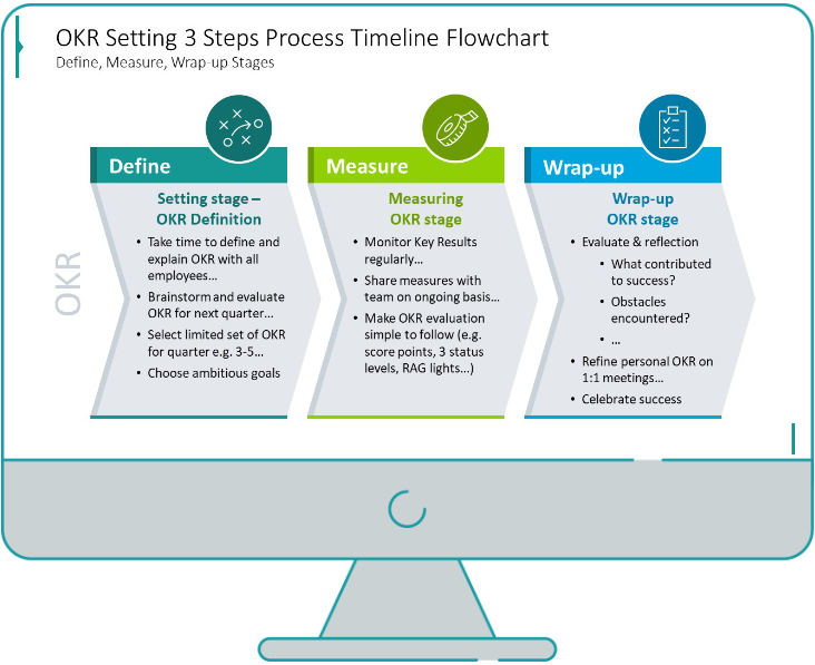
Slide Redesign: Presenting the OKR Setting Process with a Timeline Flowchart
Today I’d like to show you how creatively you can replace a typical and not attractive table with a timeline flowchart. I chose the example of the OKR setting process which contains 3 steps and has quite a lot of text, so it’s a more difficult task because there is not much area to use […]
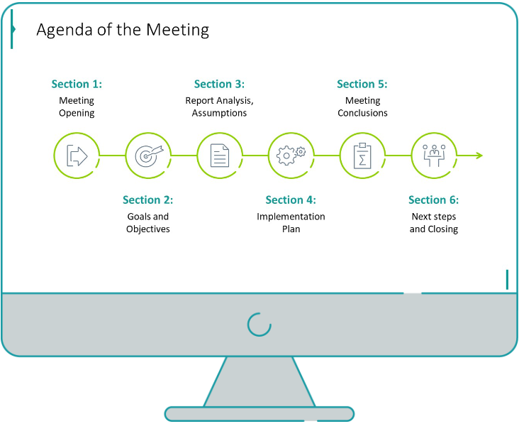
Slide Redesign: Presenting the Meeting Agenda with a Creative Timeline
I’d like to show you how you can creatively present your meeting agenda in PowerPoint. Creating a list of consecutive meeting sections is not enough to grasp your audience’s attention. If you present the agenda the boring way, it’s gonna be a signal to your participants that the meeting might be boring too. Content is […]
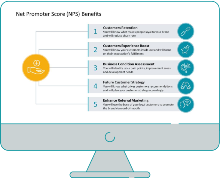
Slide Redesign: Presenting the List of NPS Benefits with a Creative Infographic
I’d like to show you an alternative way of presenting a list of the benefits in PowerPoint. Actually, a list doesn’t mean that text must be arranged in bullet points or numbers. This way of presenting content is so ordinary and common that slides with typical lists do not impress the audience. I will explain […]

What Fonts To Use In PowerPoint Presentation
What fonts are good to use, to make your slide look professional? Let us suggest you several font proposals and where to get them from.

7 Design Tips for Professional PowerPoint Slide
Here are some design best-practice rules to help you create a professional visual slides in PowerPoint:
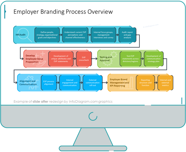
Slide Redesign: Presenting the Process of Employer Branding with the Roadmap
Today I’d like to show you a redesign of a PowerPoint slide with a multistep process with subcategories. Probably the first version will be in a form of numbered text list presenting each step. Yes, you can create it that way, but we’d like to make our slide look more attractive visually. I will work […]
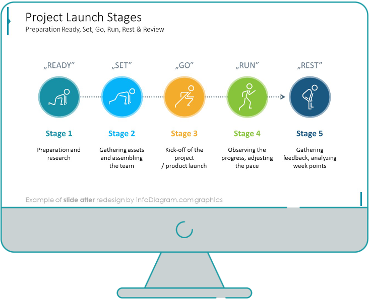
Slide Redesign: Project Launch Stages Illustrated with Activities Icons
Do you present the launch stages of your project? The easiest way to present stages is to use a number or bullet list. But it’s a common and boring solution. Let’s try to avoid using a typical PowerPoint list and instead of it let’s make a creative slide. In today’s case study, we’re going to […]

Slide Redesign: Presenting Team or Contact Persons
Do you need to present in your pitch deck the key persons to contact? The easiest way to show your team on the slide is to put the data into the table. But we don’t want to use a typical table that we know from Excel. Let’s create an interesting infographic in PowerPoint on the […]
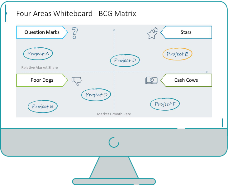
Slide Design: BCG Comparison Matrix in PowerPoint
Do you need to compare several options over two criteria? Try to use a matrix visual form. To create such a matrix comparison in your presentation you don’t need any special software for that. You can do it very easily in PowerPoint. And such a matrice can look very attractive. I’m going to illustrate it […]
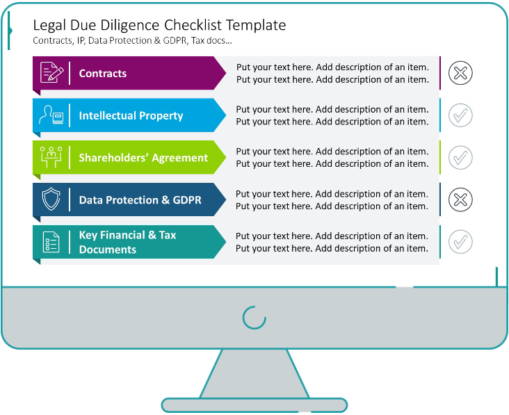
Slide Redesign: Checklist in PowerPoint on Due Diligence Example
Do you need to present a checklist of some kind? In today’s blog, we will give you some directions on how to redesign a checklist type of slide content, on the example of legal due diligence. But first, let’s see why we have optioned a checklist, rather than a standard bullet point text.
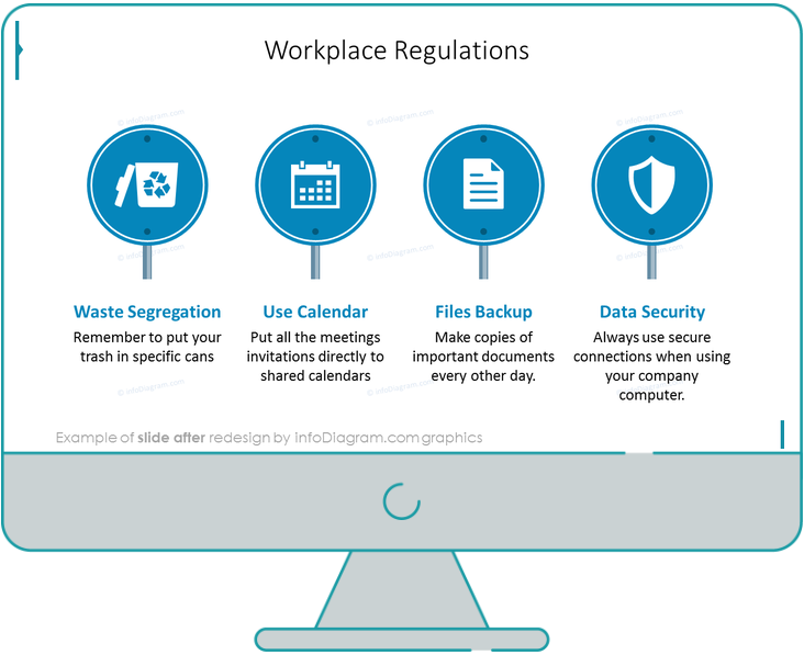
Slide Redesign: Use Road Signs Graphics for Rule Incorporation
Do you need to express rules, regulations or dos and don’ts on a slide? Consider illustrating your points with a visual metaphor everybody recognizes – traffic signs. Adding such graphics will help you to pass a clear message while having the audience’s full attention thanks to the symbols. Let’s see how we can redesign a […]